Cohort analysis
Cohort analysis groups customers by when they started and follows each group over the same ages, so a team can see whether newer customers stay, pay and behave better or worse than older ones.
Cohort analysis is a method that groups customers by when they started, such as the month of their first purchase or signup, and tracks each group over the same ages to compare retention, revenue or behavior. It shows whether newer customers stay longer than older ones, which a blended average across all customers hides.
- Origin
- Cohort methods from demography and sociology (Norval Glenn's Sage monograph); brought to startup metrics by Eric Ries, Ries's guest post, 2009
- Level
- 201 · Tool
- Fits
- Startup, Small and mid-size, Scale-up
- Time to apply
- Half a day for a first cohort table, then a monthly read
- What you need
- a date for each customer's start (signup, first purchase or first paid subscription) · a dated record of the return action: a visit, an order, a payment · at least three months of history, so more than one cohort is old enough to compare
Cohort analysis is a way to compare groups of customers that started at the same time. Instead of one retention figure for everyone, you get one row per start month and read how each row ages. The method comes from demography and sociology, where Norval Glenn’s Sage monograph covers how to separate the effects of age, calendar time and birth group. In startup practice, Eric Ries argued in 2009 that aggregate-only data can miss important trends, such as churn left over from an earlier spike in signups.
What a cohort table shows
A cohort table has one row per cohort and one column per age. Each cell answers one question: of the customers who started in this month, how many did the return action at this age? Reading across a row follows one group as it ages. Reading down a column compares different groups at the same age.
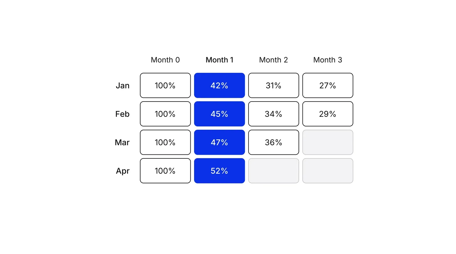
In the table above, month 1 retention climbs from 42% to 52% across four cohorts. A blended average of all customers would move slowly and hide that, because old customers dominate the base. The Tribe Capital write-up adds a second use: cohort size matters, because rising cohort sizes can mask falling value per customer.
Stripes in the table point to different causes. A pattern that repeats at the same age in every cohort, such as a drop at the annual renewal, is an age effect. A pattern that hits one cohort at every age, such as a campaign that brought the wrong audience, is a cohort event. A pattern along a calendar diagonal, such as a tax-season spike in Tribe’s Intuit example, is a calendar effect. Glenn’s book names the difficulty: age, period and cohort effects are tangled, which he calls the identification problem.
Three choices that define the table
Every cohort tool asks for the same three things: who enters, what counts as returning, and how long a period is. The settings differ by vendor, so check the definition before you compare numbers across tools.
| Tool | Who enters a cohort | Notable setting |
|---|---|---|
| GA4 cohort exploration | First touch, any event, any transaction, any conversion or a chosen event | Day, week or month; weeks run Sunday to Saturday; up to 60 cohorts |
| Mixpanel retention | Users who first perform the starting event, per day, week or month | “On or after” by default, an “on” mode, custom brackets; day-based retention limited to 60 days |
| Amplitude retention | A starting event; up to two return events | “Return on or after” versus “return on” counting |
| AppMetrica | Users grouped by install or a target event | Calendar days or 24-hour windows; minimum cohort size filter |
| ChartMogul | Customers by the interval of their first subscription | Retention, churn and net MRR views |
The counting rule changes the curve. In Amplitude’s calculation notes, “return on or after” counts users who came back on day X or any later day, while “return on” counts only day X. The first never goes up with age; the second can. For site data, Yandex does not appear to offer the same report as for apps, so its Cloud tutorial builds weekly cohorts from Metrica hit data by hand, using each user’s first visit date.
Incomplete cohorts and the rising tail
An incomplete period is the most common cause of a false curve. Amplitude documents that while an analysis window is still open, the line can curve up, because users who have not yet reached later intervals are removed from the denominator. Mixpanel marks buckets still in progress with an asterisk for the same reason.
Survival analysis handles the same problem with a rule from the Kaplan-Meier method: estimate survival one interval at a time, using only the customers who could be observed in that interval, then multiply. Take 1,000 subscribers (illustrative). 800 stay through month 1, so 0.80. Of those, 720 stay through month 2, so 0.90. Of those, 684 stay through month 3, so 0.95. Survival at month 3 is 0.80 × 0.90 × 0.95 = 0.684, or 684 of 1,000. A cohort that started last month has no month 3 yet, and its cell stays blank.
Why retention rises inside a cohort
Within a complete cohort, retention often rises with age, and it is not a sign that customers grow more loyal. Fader and Hardie’s 2007 paper uses survival data for an unnamed subscription business. In their Regular segment, 63.1% of customers survive year 1, 46.8% year 2 and 38.2% year 3. Divide each year by the one before and the retention rates are 63%, 74% and 82%, then 85%, 89% and 91%.
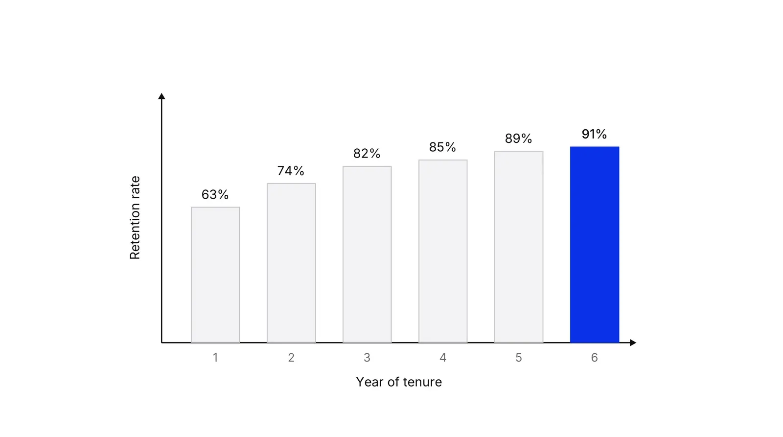
The authors explain it with a model in which each customer has a constant chance of staying, but chances differ across customers. High-churn customers leave early, and the remaining group has lower churn on average. They call it the “ruse of heterogeneity”. A 2018 follow-up finds that accounting for these cross-customer differences matters more than modeling changes in individual behavior. The practical rule: read a flattening curve as a mix of who is left, not as proof that your product built loyalty.
Revenue cohorts and net retention
A revenue cohort follows the money instead of the headcount. ChartMogul’s net MRR retention divides the recurring revenue still coming from a cohort’s subscriptions by what they paid at the start, so expansion and reactivation raise it and contraction and churn lower it. It can pass 100%. Tribe Capital describes the shape of cumulative revenue per customer the same way: a curve that bends upward means surviving customers spend more over time, a straight one means flat spend, and a downward bend means spend falls.
This is why the payments example above shows 80% of merchants and 112% of revenue at the same age. Growth accounting splits one period’s change in active users into new, retained, resurrected and churned. Jonathan Hsu positions it as one of three approaches, alongside cohort and concentration analysis. The tables answer different questions, so product-market fit checks usually read both.
From cohort tables to money
Cohort tables feed lifetime value. Gupta, Lehmann and Stuart valued five firms by customer cash flows and reported that a 1% improvement in retention raised customer and firm value by 3 to 7%. Fader and Hardie’s 2010 paper shows that using one average retention rate gives a downward-biased estimate of a customer base’s residual value, because cohort-level retention typically rises. McCarthy, Fader and Hardie valued Dish Network and Sirius XM from the counts of customers each disclosed, and a Wharton summary says their Dish valuation landed within about 5% of the trading price.
Cohort analysis, funnels and journeys
| Method | Question it answers | Unit of analysis |
|---|---|---|
| Cohort analysis | Do customers who started at a given time keep coming back? | Groups by start date, followed over age |
| Funnel analysis | Where do people drop out between steps? | Steps of one journey, at one time |
| Customer journey analytics | What paths do individuals take across touchpoints? | Individual sequences across channels |
A Growth Lab plan starts from the first cohort table: one start event, one return event, and a monthly read.
How to apply Cohort analysis, step by step
- Choose the starting event. Decide what puts a customer into a cohort: the first visit, the signup, the first order or the first paid subscription. Use the event that marks the start of the relationship you want to keep. Result: one sentence that says who belongs in the January cohort.
- Choose the return event and the time unit. Pick the action that counts as coming back, ideally the core action rather than a login: a repeat order, a processed payment, a booked visit. Pick day, week or month to match how often customers should use you. Result: one return event and one unit.
- Build the table. Put one cohort per row and age (month 0, month 1, month 2) across the columns. Divide each cell by the size of the cohort at the start. Result: a triangle of percentages.
- Blank out the cells that have not happened yet. Leave out any cell whose age the cohort has not reached, or any partly elapsed period. Counting it as zero, or averaging it in, bends the curve. Result: a table where every number is complete.
- Compare cohorts at the same age. Read down one column, for example month 1, and ask whether newer cohorts are better or worse than older ones. Then look at where each row flattens. Result: a verdict on whether retention is improving.
- Split and act. Cut the table by acquisition source, plan or first product, and check whether a mix change explains the shift. Write down one change to test and re-read the cohorts that start after it ships. Result: a hypothesis with a date to check it.
Examples
A dental clinic
Illustrative. The cohort is new patients by month of first visit; the return event is a second visit within 90 days. January has 400 new patients and 156 come back, 39%. March has 440 and 211 come back, 48%. The table shows the gap but not its cause, so the clinic checks what changed between the two months, such as reminder messages or a new front-desk script, before crediting either.
A payments startup
Illustrative. The cohort is merchants by month of first processed payment. In one cohort of 200 merchants, processing volume in month 1 is $500,000. In month 6, 160 merchants are still active and process $560,000. Logo retention is 160 / 200 = 80%; revenue retention is 560 / 500 = 112%. Growth in the surviving merchants more than covers the 40 who left, which a count of active merchants would never show.
When to use it
Use it when customers start at different times and you want to know whether retention, repeat purchase or revenue per customer is getting better. It fits subscriptions, apps, marketplaces, clinics and any business with repeat use. Run it before judging a change in onboarding, pricing or channel mix.
When not to use it
Skip it when you have only a few weeks of data or very small cohorts, because percentages swing on a handful of customers. It does not explain why people stay or leave, so pair it with interviews or a funnel analysis. For a single-visit business with no repeat behavior, a funnel is the better view.
Common mistakes
- Counting incomplete periods. Amplitude warns that a curve drawn while the window is still open can appear to rise, because users who have not reached later intervals drop out of the denominator. Wait for the window to close, or mark the cell.
- Using a login as the return event. If the return event is any visit, a notification can keep the table looking healthy while the core action fades. Choose the action that carries value.
- Reading a flattening curve as a change in individual loyalty. Fader and Hardie show that rising retention within a cohort can come from heterogeneity alone: the customers who leave first are the ones most likely to leave.
- Mixing channels in one row. If a paid campaign doubles the size of a cohort, the blended row can fall even when every channel is stable. Split by source before drawing conclusions.
- Comparing cohorts of different ages. March at month 1 and January at month 3 are different questions. Compare columns, not diagonals.
FAQ
What is cohort analysis in marketing?
It is a way to group customers by a shared start, such as the month of first purchase, and follow each group over the same ages. Marketers use it to compare acquisition channels, campaigns or product changes by how well the customers they brought in stay and spend, instead of by blended totals.
Which metrics does a cohort analysis track?
The common ones are customer retention (share still active), churn, revenue retention (share of starting revenue kept, which can exceed 100%), cumulative revenue per customer and conversion to paid. GA4 shows active users per cohort; ChartMogul offers customer retention, churn and net MRR retention.
How is a cohort different from a segment?
A segment is defined by an attribute such as country or plan. A cohort is defined by when something happened, and its members are followed as they age. You can combine them: build cohorts by signup month, then split each by plan to see which plan keeps customers longest.
Why does my retention curve go up at the end?
Two reasons. If the window is still open, later intervals leave out users who have not reached them, which inflates the figure, as Amplitude documents. If the cohort is complete, rising retention is normal: customers who were likely to leave have already gone, and those who remain are more loyal on average.
Can I run cohort analysis in GA4 or Yandex Metrica?
GA4 has a cohort exploration with day, week or month granularity, up to 60 cohorts. Yandex documents a cohort report for apps in AppMetrica. For site data, its Cloud tutorial builds weekly cohorts from Metrica Logs API data in ClickHouse and DataLens.
Sources
- Google, [GA4] Cohort exploration, Analytics Help
- Google, The Cohort Analysis report [Legacy], Analytics Help (Universal Analytics)
- Yandex AppMetrica, Cohort analysis, documentation
- Yandex Cloud, Web analytics with funnels and cohorts based on Yandex Metrica data, tutorial
- Amplitude, Build a Retention Analysis chart, vendor documentation
- Amplitude, How the Retention Analysis chart calculates retention, vendor documentation
- Mixpanel, Retention report, vendor documentation
- ChartMogul, Cohort analysis, help center
- ChartMogul, Cohort: Net MRR Retention, help center
- Peter S. Fader, Bruce G. S. Hardie, How to project customer retention, Journal of Interactive Marketing 21(1), 2007
- Peter S. Fader, Bruce G. S. Hardie, Customer-base valuation in a contractual setting: the perils of ignoring heterogeneity, Marketing Science 29(1), 2010
- Peter S. Fader, Bruce G. S. Hardie, Yuzhou Liu, Joseph Davin, Thomas Steenburgh, How to project customer retention revisited, Journal of Interactive Marketing, 2018
- Peter S. Fader, Bruce G. S. Hardie, Ka Lok Lee, Counting your customers the easy way, Marketing Science 24(2), 2005
- Daniel McCarthy, Peter Fader, Bruce Hardie, Valuing subscription-based businesses using publicly disclosed customer data, Journal of Marketing 81(1), 2017
- Knowledge at Wharton, Why your business really is only as valuable as your customers, 2016
- Sunil Gupta, Donald Lehmann, Jennifer Ames Stuart, Valuing customers, Journal of Marketing Research 41(1), 2004
- J. Martin Bland, Douglas G. Altman, Survival probabilities (the Kaplan-Meier method), BMJ 317, 1998
- Norval D. Glenn, Cohort Analysis, 2nd edition, Sage, 2004
- Jonathan Hsu, Growth accounting, Amplitude blog
- Tribe Capital, A quantitative approach to product market fit, 2019
- Eric Ries, Vanity metrics vs. actionable metrics, guest post on The Blog of Author Tim Ferriss, 2009
Last updated Oct 9, 2026


Marketing agency or growth system: when a company outgrows its agency
An agency is the right call while the founder still runs most of the company. Once the business starts copying itself into new locations or markets, it needs a system that sets goals, tests hypotheses and owns the result.

Why healthcare marketing agencies stall: the short, mid and long wins model we use with clinics
Most agencies own the click and nobody owns the front desk. How we structure clinic work in three horizons, the research behind each one, and one year of results.

Why channel tests stall after month three
Most paid channel tests do not end with a decision. They end when the budget runs out, the attribution model changes, or everyone quietly stops looking at the dashboard.