Retention curves and the smile curve
A retention curve plots the share of a starting group still active at each age; its shape shows whether a product has a core of lasting users, and the smile curve is the rare shape where lost users return.
A retention curve is a line chart of the share of a starting group of users or customers who are still active at each age. A curve that drops and then levels off shows a group that keeps coming back. A curve that falls to zero shows no such group. A smile curve, which turns upward later, appears only when lost users return.
- Origin
- Peter Fader and Bruce Hardie (retention-rate model); Sequoia's data science team, and Andrew Chen, Li Jin and Jeff Jordan at a16z (curve shapes and the smile), 2006 and 2007 (model); 2018 (a16z smile discussions)
- Level
- 301 · Advanced
- Fits
- Startup, Scale-up
- Time to apply
- A few hours to draw the first curve, then a monthly read
- What you need
- a start date for each user or customer (signup, first purchase, first payment) · a dated record of the return action that counts as active · at least one cohort old enough to show a plateau, usually several months of history
A retention curve is a line that shows what share of a starting group is still active at each age after they began. Amplitude describes it as the percent of a starting group who return or stay active as time passes: it starts at 100% and usually falls. Each line is one cohort, so the curve is one row of a cohort table drawn as a line. The shape tells you more than any single number, because it separates a product with a core of regular users from one that leaks until nobody is left.
The three shapes
Sequoia’s data science team sorts curves into flattening, declining and smiling. Amplitude adds a fourth, a curve that levels off at a low percentage, which it reads as a product that works for a small group while most users reach value too slowly.
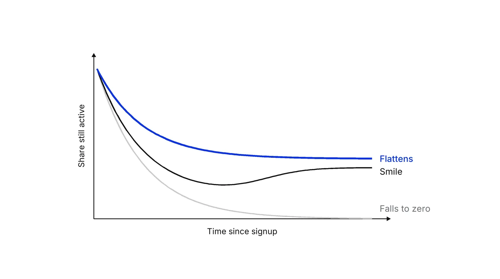
| Shape | What it says | First move |
|---|---|---|
| Flattens at a healthy level | Some users found value and keep returning; Sequoia says the higher the plateau, the healthier the product | Find who sits on the plateau and look for more of them |
| Flattens at a low level | The core product works for a few and slows everyone else down | Study onboarding for the users who leave |
| Falls toward zero | No product-market fit yet; Sequoia advises finding value for a core group before expanding | Change the product before the ad budget |
| Smile | Retention rises later, which needs a cause | Check that the rise is real |
The level matters as much as the shape. Lenny Rachitsky’s June 2020 benchmark post measures user retention at six months and gives roughly 25% as good and 45% as great for consumer social, 40% and 70% for consumer SaaS, and 70% and 90% for enterprise SaaS. He also writes that a flat curve driving a scalable acquisition strategy is enough to keep a business alive. Andrew Chen, in a September 2025 essay, argues that retention decays at a predictable half-life and that early retention predicts later retention, which is why a weak first month is hard to repair.
Two different smiles at a16z
The phrase “smile curve” names two different charts in a16z material. The first is the Power User Curve, published by Li Jin and Andrew Chen on 6 August 2018. It is a histogram of users by how many days they were active in a month, and a smile shape means a group of heavy users who come back daily or nearly daily. It shows how engagement is spread across users in one month, not how a cohort ages.
The second is the retention smile. In his post What to do when product growth stalls, which carries no date on his site, Chen writes that a narrow class of products with network effects will often show a smile when retention goes up as time passes and the network fills in. Jeff Jordan uses both meanings in the 2018 a16z podcast: the first smile for the heavy-usage histogram, and “another smile” for cohort curves that reverse because the product becomes more valuable, as he recalls from his OpenTable diligence.
Chen’s 2025 essay is more cautious. He writes that a curve that starts high, goes low and becomes high again does not happen in practice, apart from rare network-effect products. Sequoia adds that even smiling products tend to trend toward zero as competition and user behavior shift. Treat the smile as a case to verify.
Why a curve flattens or rises
A curve can level off for two reasons: some users stay for good, or the mix of who is left changes. It rises only when users come back, or when the counting rule or the open window distorts it.
The mix effect is the one teams miss. Take a cohort that is half quick leavers, who each have a 40% chance of leaving every period, and half slow leavers, who have a 5% chance. Nobody changes behavior. Yet the cohort retains 77.5% in period 1, retains about 95% in period 12, and about a quarter of the members remain by then, almost all of them slow leavers.
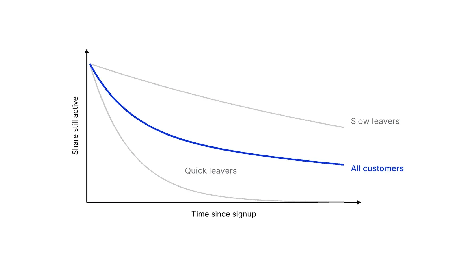
Peter Fader and Bruce Hardie built their shifted-beta-geometric model on this idea. Each customer has a constant chance of leaving, the chance differs across customers, and so the retention rate rises with time. In their data for one subscription business, the model, fitted to seven years, overestimated year-12 survival in the Regular segment by 2%. Hardie’s spreadsheet note shows how to run the model in Excel. A 2018 follow-up lets churn change with tenure, so it can produce rising and U-shaped curves, and still finds that individual churn is unlikely to fall: telling customers apart matters more.
A true rise comes from resurrected users. Jonathan Hsu’s definition of resurrected users is those who churned earlier, were inactive last period and are active again now; growth accounting shows how to count them. A feature, a recall campaign or a fuller network can all bring them back.
The rest is bookkeeping. Amplitude’s calculation notes say “return on or after” retention can only stay flat or fall, while “return on” can rise, and an unfinished window can inflate later points. Mixpanel marks in-progress buckets with an asterisk. Survival analysis answers the same problem with the Kaplan-Meier method, which counts at each interval only the people who could be observed.
Usage curves and revenue curves
Chen’s 2025 essay says revenue retention expands while usage retention shrinks. David Skok calls the revenue version negative churn: expansion from remaining customers exceeds the revenue lost to cancellations, which he describes as rare. Tribe Capital shows cohort revenue retention above 100%, about 120% after six months in its example. Draw both lines, and do not call a revenue rise a network-effect smile.
Split the line before you trust it
Phil Libin splits retention into bounce, low-value churn and high-value churn and says to measure them separately, according to Jason Lemkin’s SaaStr summary, which also reports that Evernote cut its bounce rate from 80% to 40% over 18 months. A blended curve can hide that the people who matter are staying.
From the curve to money
Retention feeds value. Gupta, Lehmann and Stuart report that a 1% improvement in retention raises customer and firm value by 3 to 7% across the firms they studied. Fader and Hardie’s 2010 paper shows that a single average retention rate understates a customer base’s residual value, because cohort retention typically rises. McCarthy, Fader and Hardie apply cohort-based valuation to Dish Network and Sirius XM.
A Growth Lab plan starts from the retention curve of the segment that stays: one definition of active, one plateau number, one test.
How to apply Retention curves and the smile curve, step by step
- Fix the cohort and the return event. Pick the event that puts a customer into the cohort and the action that counts as coming back, preferably the core action rather than a login. Result: one sentence that defines who is in the curve and what 'active' means.
- Plot only complete periods. Draw the share active at each age, from 100% at the start. Leave out any point the cohort has not reached yet, because an open window leaves users out of the denominator and lifts the line. Result: a curve where every point is final.
- Name the shape. Decide whether the line falls toward zero, flattens at a low level, flattens at a healthy level or turns up. Compare the level with a benchmark for your category, using the same retention window. Result: one label and one plateau number.
- Split before you believe it. Cut the curve by acquisition channel, plan or first action, and separate users who leave in the first sessions from those who leave later. Result: a view of which segment sits on the plateau.
- Check any rise. If a tail goes up, check the counting rule, whether the window is still open and how many users were resurrected. Only then look for a network or product cause. Result: a decision on whether the rise is real.
- Write one hypothesis and re-read. Choose one change aimed at the plateau segment or at the first-week drop, ship it to new cohorts and redraw the curve when they have aged. Result: a dated test that the next cohorts can answer.
Examples
A card app with a plateau
Illustrative. A fintech card app gets a thousand signups in a month and counts a user as active if they make a payment that week. Week 1: 400 users, 40%. Week 4: 220, 22%. Week 8: 200, 20%. Week 12: 200, 20%. The curve has flattened at 20%. The team now studies those 200 users, such as their first payment and their funding method, instead of widening the ad budget.
A clinic reminder bump
Illustrative. A dental clinic follows 500 new patients and counts a patient as active in a quarter if they had a visit. Quarter 1: 60%. Quarter 2: 30%. Quarter 3: 22%. The clinic sends recall messages in quarter 4 and the figure rises to 31%. This is a campaign effect from patients who had lapsed, not a network-effect smile, so the clinic reads it with growth accounting before claiming a better product.
Evernote and cohort age
Documented. In a 2013 interview with AllThingsD, Evernote CEO Phil Libin said the share of users who pay rises with cohort age: about 0.5% in the first month, about 7% after a year and about 25% in the oldest cohort, around five years. That is a rising curve of paying share within a cohort, so it describes revenue behavior and does not show that more users were active.
When to use it
Use it when you have cohorts old enough to show where they level off and you need to decide between fixing the product and buying more users. It fits apps, marketplaces, subscriptions, clinics and any business with repeat use. Redraw it after every onboarding, pricing or channel change.
When not to use it
Skip it for a product people use once, such as a one-off purchase, where a funnel is the right view. Do not draw it from a few weeks of data or from cohorts of a few dozen users, because the line swings on a handful of people. A curve says whether people stay, not why.
Common mistakes
- Reading a rise as loyalty. In the shifted-beta-geometric model, retention rates rise over time even though every customer's own churn chance is constant, because the quick leavers go first.
- Letting an open window fool you. Amplitude documents that incomplete windows can make a curve appear to rise, and Mixpanel marks in-progress buckets with an asterisk. Wait until the window closes.
- Comparing curves built with different rules. 'On or after' retention can only fall, while 'on' retention can rise, and benchmarks may use a different window, such as six months. Match the definition before you compare.
- Treating the smile as a goal. Andrew Chen describes the retention smile as limited to a narrow class of network-effect products, so most teams should aim for a plateau.
- Averaging everyone into one line. Phil Libin's split into bounce, low-value churn and high-value churn shows how a blended curve can hide the group that matters.
FAQ
What does a good retention curve look like?
It drops in the first days or weeks and then levels off at a plateau above zero. Sequoia's data science team says the higher the curve levels off, the healthier the product. Benchmarks vary by category: Lenny Rachitsky's 2020 post puts good six-month user retention near 25% for consumer social and 70% for enterprise SaaS.
What is the smile curve in retention?
It is a retention curve that dips and then rises again. Sequoia and Amplitude tie it to churned users returning through product development, re-engagement or network effects. Andrew Chen says it appears in a narrow class of network-effect products. At a16z the phrase also names the Power User Curve, which is a different chart.
Why does my retention curve go up?
Users who left came back; the tool counts return on the exact day rather than on or after it, as Amplitude documents; the analysis window is still open, which inflates later points; or you are reading the period-to-period rate, which rises as quick leavers go first. Rule out the last two before crediting the product.
What is the difference between a retention curve and a cohort table?
A cohort table lists retention percentages by start period and age. A retention curve plots one row, or an average of rows, as a line against age. The table suits comparing cohorts at the same age. The curve suits seeing where one group levels off.
Does a retention curve have to flatten?
Not for a business to survive. Lenny Rachitsky's 2020 benchmark post says a flat retention curve that drives a scalable acquisition strategy is enough to keep a business alive. A curve that keeps falling to zero means the business stands still only while new users keep arriving.
Sources
- Andrew Chen, What to do when product growth stalls, andrewchen.com
- Li Jin and Andrew Chen, The Power User Curve, a16z, 6 August 2018
- Andrew Chen and Jeff Jordan, a16z Podcast on growth, retention and engagement, transcript on andrewchen.com, September 2018
- Andrew Chen, Why retention is so hard for new tech products, 8 September 2025
- Sequoia Capital data science team, Retention
- Amplitude, What is a retention curve
- Amplitude, How the Retention Analysis chart calculates retention, documentation
- Mixpanel, Retention report, documentation
- Peter S. Fader and Bruce G. S. Hardie, How to project customer retention, working paper 2006, Journal of Interactive Marketing 21(1), 2007
- Peter S. Fader and Bruce G. S. Hardie, Customer-base valuation in a contractual setting: the perils of ignoring heterogeneity, Marketing Science 29(1), 2010
- Peter S. Fader, Bruce G. S. Hardie, Yuzhou Liu, Joseph Davin and Thomas Steenburgh, How to project customer retention revisited, Journal of Interactive Marketing, 2018
- Bruce G. S. Hardie and Peter S. Fader, A spreadsheet-literate non-statistician's guide to the beta-geometric model
- Daniel McCarthy, Peter Fader and Bruce Hardie, Valuing subscription-based businesses using publicly disclosed customer data, Journal of Marketing 81(1), 2017
- Sunil Gupta, Donald Lehmann and Jennifer Ames Stuart, Valuing customers, Journal of Marketing Research 41(1), 2004
- J. Martin Bland and Douglas G. Altman, Survival probabilities (the Kaplan-Meier method), BMJ 317, 1998
- Lenny Rachitsky, What is good retention, Lenny's Newsletter, 9 June 2020
- Arik Hesseldahl, Evernote CEO Phil Libin on turning loyal users into paying customers, AllThingsD, 26 December 2013
- Jason Lemkin, Phil Libin on bounce rate and high versus low value churn, SaaStr
- David Skok, SaaS metrics 2.0, For Entrepreneurs
- Tribe Capital, A quantitative approach to product market fit, 14 July 2019
- Jonathan Hsu, Growth accounting, Amplitude blog, 3 December 2019
Last updated Oct 9, 2026


Marketing agency or growth system: when a company outgrows its agency
An agency is the right call while the founder still runs most of the company. Once the business starts copying itself into new locations or markets, it needs a system that sets goals, tests hypotheses and owns the result.

Why healthcare marketing agencies stall: the short, mid and long wins model we use with clinics
Most agencies own the click and nobody owns the front desk. How we structure clinic work in three horizons, the research behind each one, and one year of results.

Why channel tests stall after month three
Most paid channel tests do not end with a decision. They end when the budget runs out, the attribution model changes, or everyone quietly stops looking at the dashboard.