Simpson's paradox and metric traps
Simpson's paradox is a pattern where a trend in the combined data reverses once the data is split into groups, and it sits among a family of metric traps that make an average say the opposite of what is happening.
Simpson's paradox is a statistical pattern in which a comparison that holds in every subgroup reverses when the subgroups are combined. It happens when the groups are different sizes and the compared sides have a different mix of them. In business metrics it shows up as blended conversion, approval or retention rates that fall while every segment improves.
- Origin
- Karl Pearson and Udny Yule (early notes); Edward H. Simpson (1951); Colin Blyth (named it a paradox), 1899, 1903, 1951, 1972
- Level
- 301 · Advanced
- Fits
- Small and mid-size, Scale-up
- Time to apply
- an hour to split one headline metric by its main segment and compare the two readings
- What you need
- the raw counts behind one headline rate, numerator and denominator, not just the percentage · the one or two dimensions that could change who ends up in each group, such as channel, device, plan or country · someone who knows how customers get sorted into those groups
Simpson’s paradox is a pattern in which a comparison that holds inside every group reverses when the groups are added together. The effect was noticed before it had a name: Pearl’s history credits Karl Pearson and colleagues in 1899 and Udny Yule in 1903 with reporting associations that vanish on aggregation, and E. H. Simpson analysed the problem in 1951. Pearl adds that sign reversal was first noted by Cohen and Nagel in 1934, and Colin Blyth called it a paradox in 1972.
The cause is arithmetic. A combined rate is an average of the group rates, weighted by how many cases each group holds. If one side of a comparison has a different mix of groups than the other, the weights differ, and the combined rate compares unlike populations. This page covers that case and four related traps that make an average mislead.
The Berkeley admissions data
Berkeley’s 1973 graduate admissions looked biased against women, and the department-level numbers pointed the other way. Bickel, Hammel and O’Connell studied the 12,763 applications complete enough for a decision. There were 8,442 male and 4,321 female applicants, and about 44% of the men and 35% of the women were admitted. Their abstract calls this a clear but misleading pattern of bias against women. After pooling the department data to account for departmental decisions, they found a small but statistically significant bias in favor of women.
The reversal is easiest to see in the six largest departments, published as the R UCBAdmissions dataset. There, 1,198 of 2,691 men (44.5%) were admitted against 557 of 1,835 women (30.4%). In Department A, 512 of 825 men (62%) were admitted against 89 of 108 women (82%). Department F admitted 22 of 373 men and 24 of 341 women, roughly 6% and 7%. Women applied more to departments with higher rejection rates, such as F, while most men applied to departments such as A and B, where admission was easier.
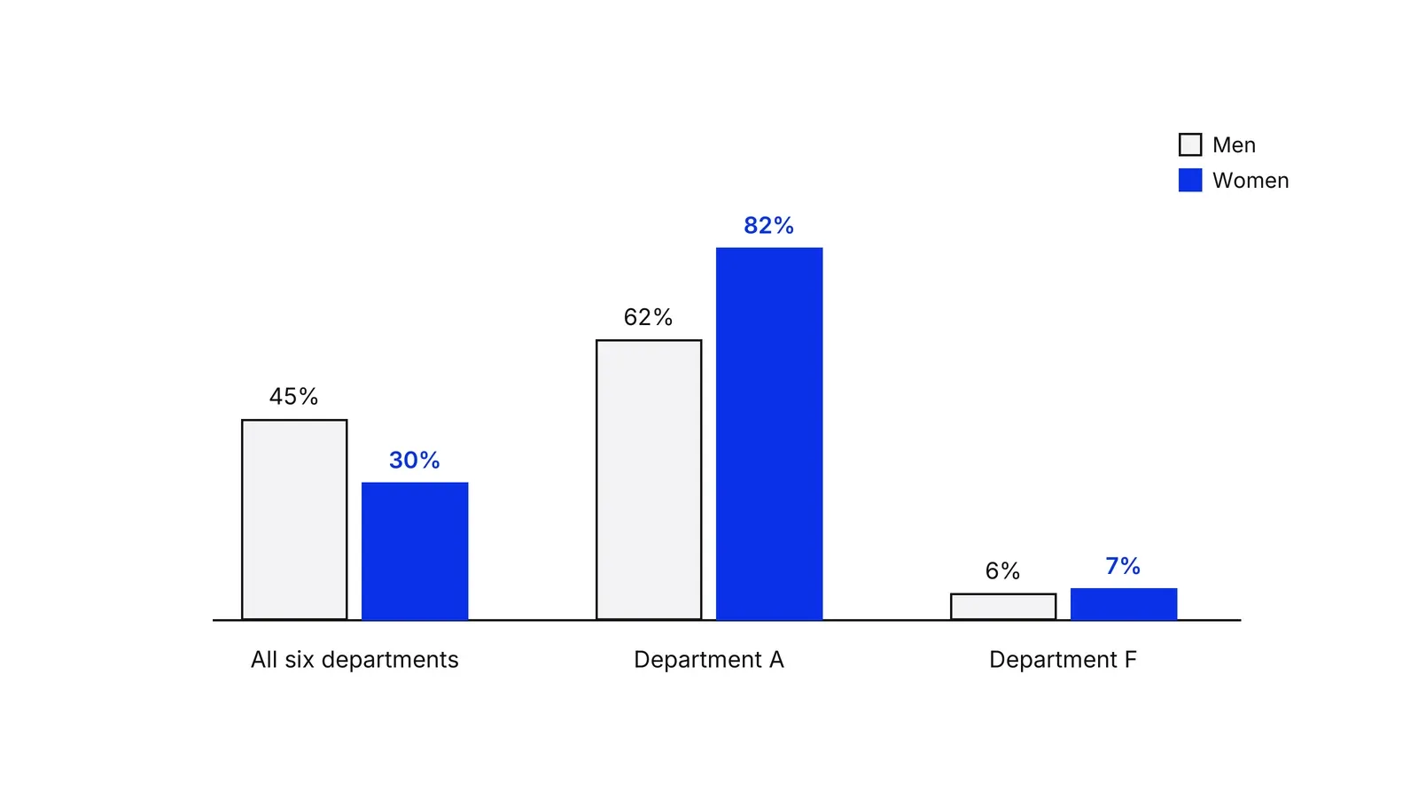
The authors placed the cause before admission: earlier stages of education and the fields women were steered towards.
The kidney stone case
In the Charig study, the pooled result favored percutaneous nephrolithotomy (PCNL), a minimally invasive procedure, over open surgery. By stone size it favored open surgery, and the table below reproduces the figures as printed in a 2023 review of Simpson’s paradox in clinical research.
| Stone size | Open surgery | PCNL |
|---|---|---|
| Under 2 cm | 81 of 87 (93.1%) | 234 of 270 (86.7%) |
| 2 cm or more | 192 of 263 (73.0%) | 55 of 80 (68.8%) |
| All patients | 273 of 350 (78.0%) | 289 of 350 (82.6%) |
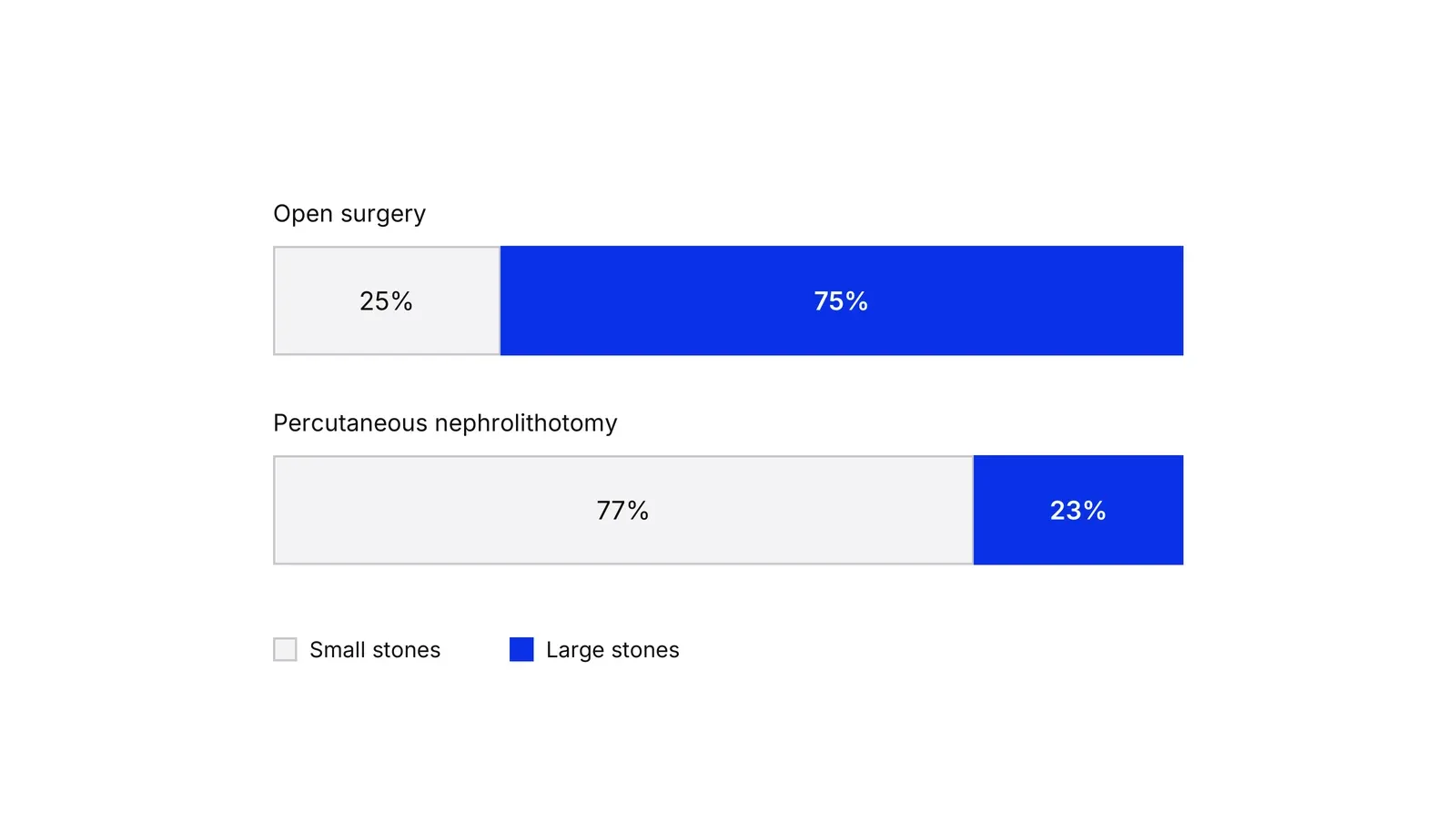
Large stones are harder to treat, and 263 of the 343 patients with large stones (77%) got open surgery. Most small stones went to PCNL. Julious and Mullee used the data in 1994 to show why the stone size had to be taken into account.
Which number do you trust?
The data cannot decide this alone. The Stanford Encyclopedia of Philosophy entry on the paradox notes that whether to split the data depends on causal assumptions about how the variables relate, and that if department choice follows from sex, department is a mediator, so conditioning on it may be the wrong move for some questions. Pearl’s account makes the same point: the paradox is resolved by a causal model, which statistics alone does not supply. Hernán, Clayton and Keiding reach a similar conclusion from epidemiology, arguing that errors arise when the problem is treated only in statistical terms.
A working rule: if something outside your control sorted cases into groups before the outcome, as stone size sorted patients, read the split. If the grouping is part of how the result is produced, ask the causal question first. Randomizing who gets which treatment removes the sorting that created the kidney stone problem. That is one reason a clean experiment, read with statistical significance in mind, is safer than a raw comparison.
Mix shift in business metrics
Mix shift is Simpson’s paradox with time as the comparison: the composition of your cases changes, and the blended rate moves although no segment did. Von Kügelgen, Gresele and Schölkopf documented a public example. Using age-stratified data from China (reported February 17, 2020) and Italy (March 9), they show the Covid case fatality rate was lower in Italy for every age group yet higher overall, 4.4% against 2.3%, because Italy’s confirmed cases skewed older. Downey’s reading of US wage series shows another: real wages looked flat or lower in most education groups since 2000 while the aggregate rose, as the mix shifted toward more educated workers.
For a growth team, the same thing hides in blended conversion, approval, churn and revenue per user. A KPI tree helps because each box is one number with one owner, so a blended rate gets split into volume and rate by segment. Cohort analysis applies the same idea along time, comparing customers of the same age rather than a blend of old and new.
Three more traps in the family
| Trap | What goes wrong | Quick check |
|---|---|---|
| Survivorship bias | You only see the cases that passed a filter, so the average describes survivors | Ask who is missing from the data and why |
| Ratio trap | An average of rates treats a 10-visit segment like a 300-visit one | Recompute from total numerators and denominators |
| Regression to the mean | An extreme result is followed by a more ordinary one with no intervention | Compare against a group that got no change |
Survivorship bias has a long record in finance. Brown, Goetzmann, Ibbotson and Ross showed in 1992 that a sample made only of surviving funds can create the look of predictable performance that is not there, and Elton, Gruber and Blake studied the same bias in mutual fund data in 1996. Abraham Wald’s wartime work on aircraft survivability, summarised by Mangel and Samaniego in 1984, is the best-known case outside finance. Damage visible on planes that returned shows where a plane can be hit and still come home.
Regression to the mean goes back to Galton, who described regression towards mediocrity in the heights of children in 1886. Stigler’s 1997 history covers how the idea developed. Barnett and colleagues note the effect is common in repeated measurements and can be reduced by study design. In practice, a campaign launched after its worst week will look good the next week without doing anything.
The ratio trap is plain arithmetic. Two segments converting at 20% on 10 visits and 10% on 300 visits average 15% as rates, but the real blended rate is 32 conversions from 310 visits, about 10.3%.
Teams that want these checks built into reporting can start from a Growth Lab plan.
How to apply Simpson's paradox and metric traps, step by step
- Get the counts, not the rate. Pull the numerator and denominator for the metric for each period or variant. A rate hides how many cases stand behind it. Result: a table of counts that every later step can recompute.
- Split by the likeliest dimension. Break the metric by the one dimension that most plausibly differs between the two sides you are comparing, such as channel, device, plan tier or country. Result: segment-level rates next to the blended rate.
- Compare the mix. For each side, write down what share of cases falls in each segment. If the shares differ a lot, the blended rate is comparing different populations. Result: a mix table that shows which segment grew or shrank.
- Check whether the direction flips. Compare blended rates and segment rates. If the blended comparison points one way and most segments point the other, you have a reversal. Result: a clear yes or no on whether the headline is safe to quote.
- Decide which view answers your question. Ask how people got into the groups. If something outside the treatment, like stone size or traffic source, decided who got what, trust the split. If the grouping happens after the treatment, splitting can hide the effect. Result: one written sentence naming the view you trust and why.
- Report both numbers. Show the blended figure and the segment figures side by side, with the mix. Result: a metric line that cannot be read two ways by the next person.
Examples
A landing page and a traffic shift
Illustrative, the numbers are arithmetic only. In month one, a landing page gets 1,000 desktop visits converting at 10% and 1,000 mobile visits converting at 2%, so 120 sign-ups from 2,000 visits is 6.0% overall. In month two a new campaign sends mostly mobile traffic: 400 desktop visits at 11% (44 sign-ups) and 3,600 mobile visits at 3% (108 sign-ups). Both segments improved, yet 152 sign-ups from 4,000 visits is 3.8%. The page got better and the blended number fell.
Kidney stone treatments in the BMJ
In a 1986 BMJ study by Charig and colleagues, open surgery succeeded in 273 of 350 patients (78%) and percutaneous nephrolithotomy in 289 of 350 (83%). Reanalyses of those data split by stone size show open surgery ahead in both groups, 93% against 87% for small stones and 73% against 69% for large ones. Doctors sent the harder, larger stones to open surgery, so the pooled figure compared different patients.
A payments approval rate
Illustrative, no real company implied. A payments company sends 1,000 card payments a month through two corridors. In month one, corridor A carries 800 payments at 95% approval and corridor B carries 200 at 70%, so 900 of 1,000 are approved, 90%. In month two the sales team wins a large corridor B merchant. Corridor A carries 300 payments at 96% (288 approved) and corridor B carries 700 at 72% (504 approved). Both corridors improved, and the blended approval rate fell to 79.2%.
When to use it
Use it whenever a headline rate or average is compared across two periods, two variants or two groups and the people or cases in each are not identical. It matters most for conversion, approval, churn and revenue-per-user dashboards, and before any decision to cut or fund something because of a blended number.
When not to use it
Skip the heavy version when groups are the same size and mix on both sides, as in a clean randomized test, or when the sample is so small that segment rates are noise. Splitting a tiny sample into six segments invents patterns. In that case start with the sample size and significance questions instead.
Common mistakes
- Splitting by every available dimension until something flips, then reporting the flip. Choose the dimension from how customers get sorted, before looking at the result.
- Always trusting the split. If the segment is itself caused by the thing you are measuring, such as a department chosen because of the applicant's earlier schooling, the aggregate can be the right view for some questions.
- Quoting a rate without its denominator, so a 100% rate on 3 cases looks the same as 100% on 3,000.
- Averaging segment rates when the segments differ in size. The average of 20% on 10 visits and 10% on 300 visits is not 15%.
- Treating a reversal as proof of a cause. The data shows the pattern; only knowledge of how the data was produced says which reading is right.
FAQ
What is Simpson's paradox in statistics?
It is a result where an association between two variables appears, disappears or reverses when the data is divided into subgroups. The Stanford Encyclopedia of Philosophy describes it this way. It arises because group sizes weight each subgroup's rate differently in the combined figure, so the combined rate can point the opposite way.
Can you explain Simpson's paradox in simple words?
A winner overall can lose in every group. If team A plays mostly easy opponents and team B mostly hard ones, A can have the better overall record and the worse record against every kind of opponent. The overall record mixes who you played with how you played.
Is Simpson's paradox a real problem or just a puzzle?
It is real. The Berkeley admissions data of 1973 and the Italy and China Covid fatality rates both showed it. Kievit and colleagues argue it is more common in research than usually assumed, and a simulation they cite found full reversals in about 1.67% of random 2x2x2 tables.
Should I always use the split data instead of the combined data?
No. Which view is right depends on how the groups were formed, not on the arithmetic. If an outside factor sorted cases into groups, split by that factor. If the grouping lies on the path from your action to the result, the combined figure may answer the question.
How is survivorship bias different from Simpson's paradox?
Survivorship bias is a missing-data problem: you only see the cases that passed a filter, such as funds that did not close. Simpson's paradox is a mixing problem: you see all the cases but combine unlike groups. Both give averages that mislead, and both are fixed by asking who is in the data.
Sources
- Peter J. Bickel, Eugene A. Hammel, J. William O'Connell, Sex Bias in Graduate Admissions: Data from Berkeley, Science 187(4175), 1975
- C. R. Charig, D. R. Webb, S. R. Payne, J. E. Wickham, Comparison of Treatment of Renal Calculi by Open Surgery, Percutaneous Nephrolithotomy, and Extracorporeal Shockwave Lithotripsy, BMJ 292, 1986
- S. A. Julious, M. A. Mullee, Confounding and Simpson's Paradox, BMJ 309, 1994
- Stefanos Bonovas, Daniele Piovani, Simpson's Paradox in Clinical Research: A Cautionary Tale, Journal of Clinical Medicine 12(4), 2023
- E. H. Simpson, The Interpretation of Interaction in Contingency Tables, Journal of the Royal Statistical Society Series B 13(2), 1951
- G. Udny Yule, Notes on the Theory of Association of Attributes in Statistics, Biometrika 2(2), 1903
- Colin R. Blyth, On Simpson's Paradox and the Sure-Thing Principle, Journal of the American Statistical Association 67(338), 1972
- Judea Pearl, Understanding Simpson's Paradox, UCLA Technical Report R-414, 2013 (edited version in The American Statistician, 2014)
- Miguel A. Hernán, David Clayton, Niels Keiding, The Simpson's Paradox Unraveled, International Journal of Epidemiology 40(3), 2011
- Rogier A. Kievit, Willem E. Frankenhuis, Lourens J. Waldorp, Denny Borsboom, Simpson's Paradox in Psychological Science: A Practical Guide, Frontiers in Psychology, 2013
- Stanford Encyclopedia of Philosophy, Simpson's Paradox
- Julius von Kügelgen, Luigi Gresele, Bernhard Schölkopf, Simpson's Paradox in Covid-19 Case Fatality Rates: A Mediation Analysis of Age-Related Causal Effects, arXiv 2005.07180
- R Documentation, UCBAdmissions: Student Admissions at UC Berkeley (datasets package)
- R Documentation, ucberk: University California Berkeley Graduate Admissions (VGAM package)
- Marc Mangel, Francisco J. Samaniego, Abraham Wald's Work on Aircraft Survivability, Journal of the American Statistical Association 79(386), 1984
- Stephen J. Brown, William N. Goetzmann, Roger G. Ibbotson, Stephen A. Ross, Survivorship Bias in Performance Studies, Review of Financial Studies 5(4), 1992
- Edwin J. Elton, Martin J. Gruber, Christopher R. Blake, Survivor Bias and Mutual Fund Performance, Review of Financial Studies 9(4), 1996
- Francis Galton, Regression Towards Mediocrity in Hereditary Stature, Journal of the Anthropological Institute 15, 1886
- Stephen M. Stigler, Regression Towards the Mean, Historically Considered, Statistical Methods in Medical Research 6(2), 1997
- Adrian G. Barnett, Jolieke C. van der Pols, Annette J. Dobson, Regression to the Mean: What It Is and How to Deal with It, International Journal of Epidemiology 34(1), 2005
- Allen B. Downey, Simpson's Paradox and Real Wages, Probably Overthinking It
Last updated Oct 9, 2026


Marketing agency or growth system: when a company outgrows its agency
An agency is the right call while the founder still runs most of the company. Once the business starts copying itself into new locations or markets, it needs a system that sets goals, tests hypotheses and owns the result.

Why healthcare marketing agencies stall: the short, mid and long wins model we use with clinics
Most agencies own the click and nobody owns the front desk. How we structure clinic work in three horizons, the research behind each one, and one year of results.

Why channel tests stall after month three
Most paid channel tests do not end with a decision. They end when the budget runs out, the attribution model changes, or everyone quietly stops looking at the dashboard.