Wardley mapping
Wardley mapping is a way to draw what your business depends on, from the user's need down to the infrastructure, and show how each part is changing, so you can decide where to build, where to buy and where to act first.
Wardley mapping is a strategy technique, developed by Simon Wardley from 2005, that draws a business as a chain of components serving a user need. Each component sits on two axes: how visible it is to the user and how far it has evolved, from genesis through custom built and product to commodity. The map shows where to build, buy or move first.
- Origin
- Simon Wardley, 2005 (first map); evolution curve published 2008
- Level
- 301 · Advanced
- Fits
- Scale-up, Enterprise
- Time to apply
- two to four hours for a first map of one product line, then regular revisions
- What you need
- one product line or service to map, with a named type of user · four to eight people who know the business, from sales to engineering · a whiteboard or a shared canvas, sticky notes or a free mapping tool
Wardley mapping is a technique for drawing what a business depends on, from the user’s need down to the power supply, and showing how each part is changing. Simon Wardley drew his first map in 2005 for an online photo service he ran. In a 2021 interview he named the company as Fotango and said he went on to use maps when running strategy at Canonical.
In the first chapter of his book he describes himself as a CEO who had business process maps, trend charts and SWOT grids, and none of them showed how things could change. A chess player sees the board and where each piece can move. He wanted the same for a company. The book, Wardley Maps, is published free on Medium under a Creative Commons Attribution-ShareAlike 4.0 licence. Public users named in a 2019 ECIS paper include UK government departments, HS2, the NHS and the Co-op.
The two axes of a Wardley map
A Wardley map places every component by two measures. The vertical axis is the value chain: the user and their need sit at the top, and each component needs the ones below it. The higher a component sits, the more visible it is to the user. The horizontal axis is evolution, running from genesis on the left to commodity on the right.
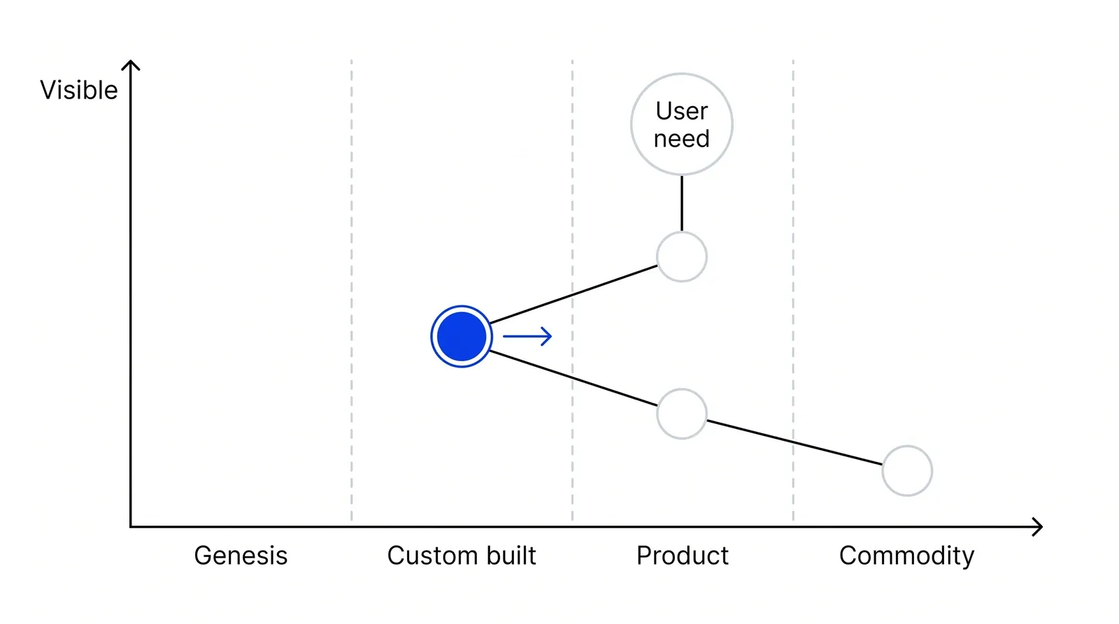
Wardley lists six basic elements of any map. It is visual and specific to one context, and it shows components, their position relative to an anchor, and their movement. The anchor is the user. Take a tea shop. The customer sees the cup of tea and the cake. They do not see the water supply or the electricity, which sit at the bottom of the map.
The four stages of evolution
Every component moves from left to right as competition pushes it from rare to commonplace. Wardley describes each stage in chapter 2 of the book, and each calls for a different way of working.
| Stage | What it looks like | Where the focus goes | A common response |
|---|---|---|---|
| Genesis | New, rare, uncertain, changing constantly | Exploration, accepting failure | Build and experiment |
| Custom built | Made to order, still being learned | Learning and craft | Build if it sets you apart |
| Product (including rental) | Made through a repeatable process, many suppliers | Refining and improving | Buy or rent |
| Commodity (including utility) | Standard, high volume, undifferentiated | Removing variation, efficiency | Use a utility or standard supplier |
The last column drives build-or-buy decisions. Wardley points out that, as late as 2016, companies were still custom building their own CRM systems, a component almost every rival buys.
How do you know which stage a component is in?
You place each component by describing its traits, because evolution cannot be measured over time. Wardley’s questions are short. How widespread and well defined is it? Do all your competitors use it? Can you buy it as a product or a utility? Is it new?
The stages come from his research in 2007, described in chapter 7. He found that adoption curves could not tell how evolved something was, so he looked at how writing about a technology changes. Articles about radio moved from the wonder of it, to how to build one, to which one is best, to what to listen to. Plotting how certain and how widespread activities became, he found they followed the same path. He published the resulting evolution curve in 2008. Hruby and Kiehn, in a 2021 workshop paper, describe the method as built between 2005 and 2010, so the 2005 date marks the first map, not the finished technique.
Wardley calls placement the main cause of arguments in the group. People often call a component unique when every competitor has it, or describe it by how they treat it instead of how the market treats it.
Movement, climate and inertia
Wardley calls the forces that move them climatic patterns, changes that happen whatever you do. The first is that everything evolves under supply and demand competition. Another is that past success breeds inertia: a supplier that profits from a product resists the shift to a utility, and so does a customer with an installed base.
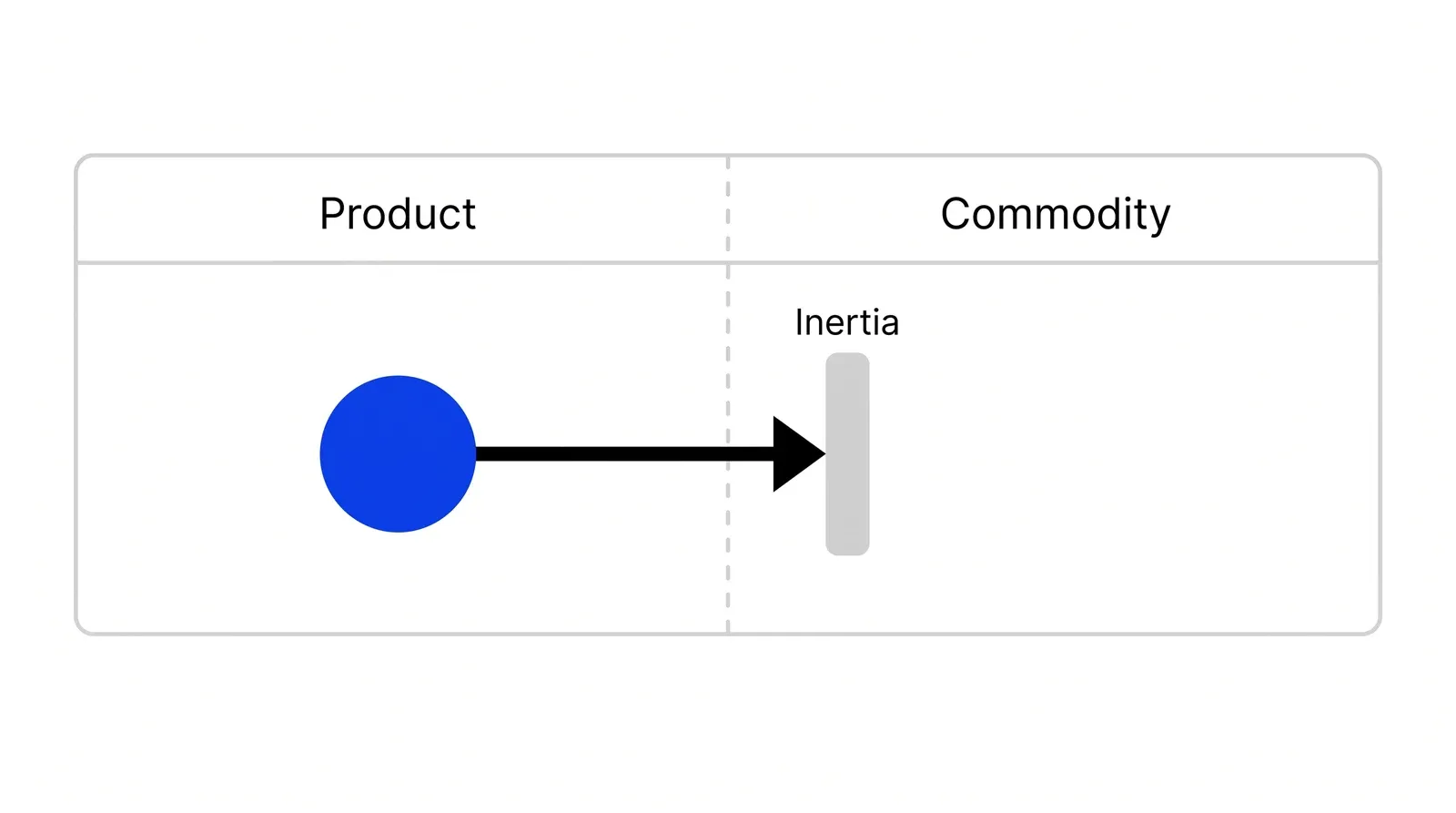
Chapter 3 lists these patterns. Chapter 4 adds doctrine, principles Wardley holds apply everywhere, such as focusing on user need, using a common language and removing duplication. Gameplay comes last: the moves specific to your map. His advice in chapter 6 is “where before why”: first find where you could act, then decide why one place beats another.
Wardley map, value chain and SWOT compared
Wardley and Michael Porter, whose value chain appears in his book Competitive Advantage, use the term differently.
| Wardley map | Porter’s value chain | SWOT | |
|---|---|---|---|
| Starts from | A user need | The firm’s activities | The firm’s own view |
| Shows change over time | Yes, the evolution axis | No | No |
| Main question | Where should we act, and what should we build or buy? | Where is margin made or lost? | What helps or hurts us? |
| Output | A map to argue over and redraw | A cost breakdown by activity | Four lists |
For Porter’s version, see our page on value chain analysis. Wardley’s 2015 introduction to mapping says a value chain alone is of little use because it shows no movement.
What the evidence says
There is little formal research on whether mapping improves outcomes. The fullest study, presented at ECIS 2019 in Stockholm by Pujadas, Thompson, Venters and Wardley, drew on 25 interviews of about an hour with CEOs, CIOs, CTOs, consultants and strategists. Wardley is a co-author, and the study excluded non-users. It also notes that Map Camp London grew from 180 attendees in 2017 to 460 in 2018. Practitioners named four limits: the learning curve, the difficulty of defining customer needs, imprecision (some asked whether the vertical axis should have a scale) and weak tooling. In April 2019 Thoughtworks put the method in the Assess ring of its Technology Radar and said the value lies in building the map together, not in the diagram. Treat the map as a structured argument among people who know the business.
Software teams pair it with domain-driven design (DDD) and Team Topologies to sort core, supporting and generic subdomains into build, buy and outsource, as Susanne Kaiser showed in InfoQ in July 2023. In Pushers’ Growth Lab work, a map like this comes before a build-or-buy budget, because it shows which components set a company apart and which it should rent.
How to apply Wardley mapping, step by step
- Set the scope and the user. Pick one line of business or one service, not the whole company, and name who uses it. A clinic network might map online appointment booking for patients. Result: one sentence naming the scope and the user who anchors the map.
- Write down what the user needs. List the user's needs in their terms, not yours. Making a profit is your need; a patient's need is a confirmed slot at a convenient time. Wardley warns that describing your own needs instead is the most common trap. Result: three to six user needs at the top of the map.
- Build the chain of components. For each need, ask what components are required to meet it, then what those components need, until you reach things you simply consume, such as power or cloud compute. Draw lines for each dependency. Things the user sees go near the top. Result: a value chain of 10 to 25 components.
- Place each component on the evolution axis. Draw four bands left to right: genesis, custom built, product, commodity. Move each component to its stage using Wardley's questions: how well defined and widespread is it, do all competitors use it, can you buy it as a product or utility, is it new? Result: a first map, plus a list of components the group argued about.
- Challenge the map with others. Show it to people outside the room, look for components that are duplicated across teams, and check anything placed far left that your rivals buy off the shelf. Result: a corrected map and a list of things you are custom building that the market already sells.
- Mark movement and choose where to act. Add arrows for components you expect to move right in the next one to three years, mark where past success will resist that change, then list the places you could act. Decide where before you decide why. Result: two or three options for action, each tied to a point on the map.
Examples
Simon Wardley's online photo service, 2005
Wardley's first map, from 2005, covered an online photo service he ran at Fotango. Mapping it, he listed four places to act and anticipated that a code execution platform would become a utility, what is now called serverless. The company built that platform, Zimki, which Wardley says priced compute per function years before AWS Lambda launched in 2014. The parent company later outsourced the business, and the platform did not survive, a case Wardley tells against himself in chapter 5 of his book.
HS2 mapping its technology estate
In a 2014 post on the UK government's technology blog, James Findlay, chief information officer of the High Speed Two rail project, described mapping HS2's technology. Applications such as building information model visualisation sat near the user, compute power sat at the bottom as a utility. He wrote that the map gave technical and non-technical people one way to discuss strategy and helped him explain why to adopt cloud services instead of following a trend.
A cross-border payments startup deciding what to build
Illustrative, no real company implied. A startup paying freelancers abroad maps one user need: get paid in local currency within a day. The chain runs through onboarding, identity checks, FX pricing, payout rails, a ledger and cloud hosting. Identity checks land in product, sold by many vendors, so the team buys them. Hosting is a commodity. Only FX pricing for thin currency corridors sits in custom built, and that is where its engineers go.
When to use it
Use it when you need to decide what to build in-house and what to buy, when a market you depend on is shifting (cloud, payments infrastructure, AI models), before a large technology or outsourcing decision, or when teams keep arguing about strategy without a shared picture of what the business runs on.
When not to use it
Skip it for a quick prioritisation of tasks or for choosing between marketing channels, where the map adds hours for little gain. It also helps less before you know who your users are, since the whole map hangs from a user need, and when no one in the room knows how the underlying components are bought and built.
Common mistakes
- Mapping your own needs, such as revenue or growth, instead of the user's, which leaves the map with no real anchor.
- Placing components by how you treat them rather than by how the market treats them, for example calling a custom-built CRM genesis when every rival buys one.
- Trying to map the whole company in one giant map; Wardley calls this the Deathstar and advises starting small and iterating.
- Treating the finished map as the deliverable. The value comes from the argument it starts and from redrawing it as things move.
- Reading the x-axis as time. Evolution cannot be measured over time, only described by stage, so a map shows direction, not dates.
FAQ
What is a Wardley map?
A Wardley map is a diagram of everything needed to serve a user need, with each component placed by two measures: how visible it is to the user (vertical) and how evolved it is, from genesis to commodity (horizontal). Simon Wardley developed it from 2005 to give strategy a map with position and movement, like a chess board.
What are the four stages of evolution in a Wardley map?
Genesis covers the new and uncertain, where the focus is exploration. Custom built covers things made to order while people still learn about them. Product covers things made through a repeatable process and sold by several suppliers. Commodity, including utility, covers standardised, high-volume components where the aim is efficiency and removing variation.
What is the difference between a Wardley map and a value chain?
A value chain, in Wardley's sense, is the chain of components needed to meet a user need. A Wardley map adds a horizontal evolution axis showing how each component changes. Wardley says a value chain alone is of little use for strategy because it shows no movement. Porter's value chain is a different tool for analysing margin by activity.
Is Wardley mapping free to use?
Yes. Simon Wardley published his book Wardley Maps chapter by chapter on Medium under a Creative Commons Attribution-ShareAlike 4.0 licence, so anyone can read, use and adapt it with attribution. Several free drawing tools exist, and many teams start with a whiteboard and sticky notes.
How long does it take to make a Wardley map?
Wardley advises keeping a first attempt to a couple of hours, three to four at most, with two or three people who know the business well. If it raises no questions about user needs by then, he says, stop. Placing components on the evolution axis takes longest, because that is where people disagree.
Sources
- Simon Wardley, Wardley Maps, chapter 1, On being lost, Medium, 2016
- Simon Wardley, Wardley Maps, chapter 2, Finding a path, Medium
- Simon Wardley, Wardley Maps, chapter 3, Exploring the map, Medium
- Simon Wardley, Wardley Maps, chapter 4, Doctrine, Medium
- Simon Wardley, Wardley Maps, chapter 5, The play and a decision to act, Medium
- Simon Wardley, Wardley Maps, chapter 6, Getting started yourself, Medium
- Simon Wardley, Wardley Maps, chapter 7, Finding a new purpose, Medium
- Simon Wardley, Wardley Maps, chapter 8, Keeping the wolves at bay, Medium
- Simon Wardley, Wardley Maps, chapter 18, Better for less, Medium
- Leanpub, Wardley Maps by Simon Wardley, CC BY-SA 4.0 edition
- WardleyMaps.com, What is Wardley Mapping?
- Simon Wardley, An introduction to Wardley (Value Chain) Mapping, Bits or pieces? blog, February 2015
- Simon Wardley, On Pioneers, Settlers, Town Planners and Theft, Bits or pieces? blog, March 2015
- Liam Maxwell with contributions from Simon Wardley and others, Better for Less: How to make Government IT deliver savings, September 2010
- The New Stack, Simon Wardley on Mapping Our Way to a Common Language, 2021
- Roser Pujadas, Mark Thompson, Will Venters, Simon Wardley, Building situational awareness in the age of service ecosystems, ECIS 2019, LSE Research Online
- Pavel Hruby, Jesper Kiehn, Value Aspects of Wardley Maps, Workshop on Value Modelling and Business Ontologies 2021, CEUR-WS Vol-2835
- Andrew D. Kay, Rosa Sun, Introduction to Strategic Planning for the Medical Trainee Using Wardley Maps, Journal of Medical Education Research
- Thoughtworks Technology Radar, Wardley mapping, April 2019
- GOV.UK Government Technology blog, James Findlay, Guest post: mapping the way to a strategy, April 2014
- InfoQ, Susanne Kaiser, Adaptive socio-technical systems with Wardley Mapping, Domain-Driven Design and Team Topologies, July 2023
- Will Larson, Refining strategy with Wardley Mapping, lethain.com, January 2025
Last updated Oct 9, 2026


Marketing agency or growth system: when a company outgrows its agency
An agency is the right call while the founder still runs most of the company. Once the business starts copying itself into new locations or markets, it needs a system that sets goals, tests hypotheses and owns the result.

Why healthcare marketing agencies stall: the short, mid and long wins model we use with clinics
Most agencies own the click and nobody owns the front desk. How we structure clinic work in three horizons, the research behind each one, and one year of results.

Why channel tests stall after month three
Most paid channel tests do not end with a decision. They end when the budget runs out, the attribution model changes, or everyone quietly stops looking at the dashboard.