Gantt chart
A Gantt chart lays a project's tasks out as horizontal bars on a calendar, so a team can see when each task starts and ends, who owns it and which tasks have to wait for others.
A Gantt chart is a bar chart of a project schedule: each task is a horizontal bar on a calendar, so a team sees when work starts and ends, who owns it and which tasks wait for others. Henry Gantt's charts date from the 1910s. It shows the plan clearly but hides dependencies and uncertainty unless you add them.
- Origin
- Henry L. Gantt, popularised by Wallace Clark; Karol Adamiecki's harmonogram is an earlier, disputed parallel, 1910s; Clark's book 1922
- Level
- 201 · Tool
- Fits
- Startup, Small and mid-size, Scale-up
- Time to apply
- About two hours for a first chart of a project with 15 to 30 tasks
- What you need
- a project with a fixed finish date or a deadline that matters · the people who will do the work, to size each task with you · a spreadsheet or a scheduling tool that can draw bars on a calendar
A Gantt chart is a bar chart of a project schedule. Each task is a horizontal bar on a calendar, with the bar’s left edge at the start and its right edge at the finish. In a survey of about 750 project managers, cited by Geraldi and Lechter, the Gantt chart ranked fourth among 70 project tools. The chart is easy to read and easy to get wrong, and most of this page is about the second part.
Where does the Gantt chart come from?
It comes from American factory management in the 1900s and 1910s. Henry L. Gantt (1861 to 1919), a mechanical engineer who worked with Frederick Taylor, published a paper on graphic production planning in 1903, the same year as Taylor’s Shop Management, according to James Wilson’s 2003 review. His first charts tracked each worker’s output against a target. Geraldi and Lechter date the version we recognise to about 1914, when Gantt faced the problem of coordinating wartime production across the United States and began comparing the plan with what was actually done.
Wallace Clark, a consulting engineer, spread the method. His 1922 book The Gantt Chart: A Working Tool of Management describes the idea in one line: work planned and work done are shown in the same space. Daniel Wren’s 2015 history shows Clark carrying the chart to Europe and Britain in the 1930s.
The authorship is less tidy than the name suggests.
| Claim | Who makes it | What we could verify |
|---|---|---|
| Gantt developed the chart | Wilson (2003), Geraldi and Lechter (2012), Wren (2015) | His 1903 paper and the wartime chart of about 1914 are documented. The ASME named its management medal after him in 1929 |
| Adamiecki made it first | Mosaic Projects, which dates his harmonogram to 1896 | The university that bears his name lists publications on it from 1927 and 1931, and Debicki (2015) reviews his work. The 1896 date rests on later accounts |
| It was made for projects | A common assumption | Geraldi and Lechter find Gantt built it for repetitive operations, with the first project-style chart in 1941. Use grew later with CPM and PERT |
Two things follow. The chart was built for repetitive factory work with known task times. And it reached project management almost unchanged.
How to read a Gantt chart
Read it as a calendar with a column of tasks. The left edge of a bar is the planned start, the right edge is the planned finish, and the length is the duration. Four other marks do most of the work.

- Milestones are diamonds: a date with no duration, such as a launch.
- Dependency arrows join a task to the one that waits for it. Build cannot start until Design ends.
- The today line shows where the project stands. Bars it cuts through are in progress.
- A baseline is a saved copy of the first approved plan. The GAO’s schedule guide treats measuring performance against an approved plan as part of a reliable schedule.
You can draw all of this in a spreadsheet. Microsoft’s Excel method builds a stacked bar chart and hides the start series so only the duration bars show. Excel does not draw dependency arrows for you, so a tool built for scheduling saves time once a project passes 20 or so tasks.
What the bars hide: the critical path and float
A typical Gantt chart shows when tasks are planned. It does not say which ones matter most. NASA’s schedule handbook is plain about it: in its typical form the chart does not show task dependencies, so it is impossible to tell how one task slipping may affect another.
The critical path method answers that. James Kelley and Morgan Walker developed it at DuPont for scheduling plant shutdowns, and presented it in 1959. A critical job, in their definition, is one whose delay delays the whole project. The critical path is the longest chain of such jobs. NASA’s handbook adds float: the time a task can slip before the finish date moves. A task with zero float delays the finish one for one.
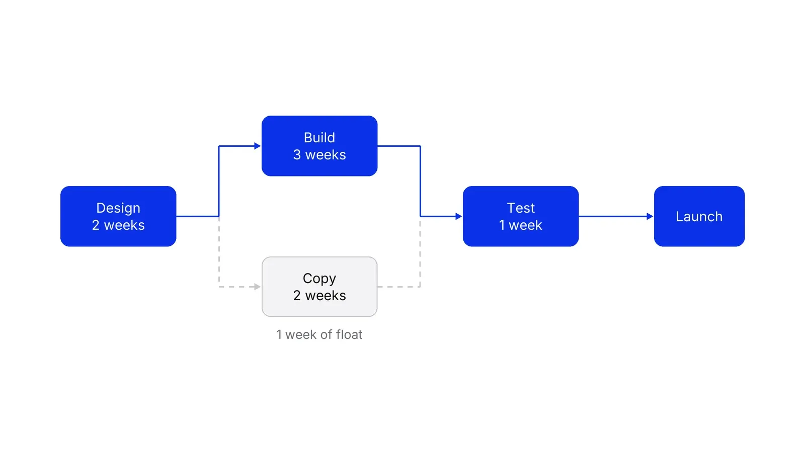
In the example, Design (2 weeks), Build (3) and Test (1) make a six-week chain. The Copy task takes 2 weeks and fits beside Build, so it has one week of float. Add a week to Build and the launch moves a week. Add a week to Copy and nothing moves. A bar chart colours both tasks the same. A network shows the difference, which is why most scheduling tools compute the path and then show it on the chart.
Why do plans on a Gantt chart slip?
Because the dates are guesses drawn in ink. In Buehler, Griffin and Ross’s 1994 study, students predicted their theses would take 33.9 days on average and took 55.5, and 29.7% finished within the time they predicted. Flyvbjerg, Holm and Buhl studied 258 transport projects to find what drives cost escalation. Flyvbjerg’s 2006 paper puts the cause of forecast error in optimism bias and strategic misrepresentation, and suggests basing forecasts on how comparable past projects actually went.
Geraldi and Lechter go further. They derive six principles from the chart’s Scientific Management roots: it is time-focused, objective, deterministic, analytic, accountable and sequential. The chart works when tasks can be described precisely, uncertainty is low and the order is mostly linear. It works poorly when work loops. Software testing that sends work back to design is their example, and they note that a bar cannot show how many loops will occur. Their advice is to use the chart reflectively, for key deadlines, sequence and negotiating durations, and to treat it as a proposal that people can still change.
Gantt chart, Kanban and Scrum
The three answer different questions.
| Tool | Question it answers | Strength | Weakness |
|---|---|---|---|
| Gantt chart | When does each task happen, and who waits for whom? | Shows sequence and the finish date | Hides uncertainty; needs upkeep |
| Kanban | How is work flowing right now? | Measures flow with WIP, throughput and cycle time | Gives no calendar for a fixed deadline |
| Scrum | What will we finish in the next sprint of a month or less, per the Scrum Guide? | Plans in short cycles and welcomes change | Does not draw a long plan |
The Kanban Guide forecasts with probabilities, for example that 85% of items finish in eight days or less, where a Gantt chart gives one date. The Agile Manifesto tells teams to welcome changing requirements, which a fixed bar resists. Many teams combine them: a Gantt chart for external deadlines and cross-team dependencies, a board for daily work.
Two management habits make the chart work. A RACI matrix gives each bar one accountable owner, and an operating rhythm sets the weekly slot where the today line moves and the baseline is checked. A Growth Lab plan starts from a schedule like this and checks each estimate against how long similar work took before.
How to apply Gantt chart, step by step
- Fix the outcome and the date. Write the one result the project must deliver and the date that matters, such as a launch or a licence deadline. Everything on the chart exists to reach this point. Result: one finish line, shown as a milestone at the right edge.
- Break the work into tasks of a few days to two weeks. List every piece of work with the people who will do it. A task shorter than a day clutters the chart; one longer than a month hides trouble. Result: a task list where each task has one owner and one visible output.
- Estimate with the people who do the work. Ask each owner for a duration and what they need before they can start. Compare any estimate against how long similar tasks took last time. Result: a duration for every task, plus a note of the tasks it waits for.
- Link the dependencies and draw the bars. Place each bar on the calendar so it starts after the tasks it needs. Draw an arrow for every real wait. Result: a chart where a late task visibly moves the ones behind it.
- Mark the critical path and the float. Add up the durations along each chain of waiting tasks. The longest chain sets the finish date, so colour it. The other chains have float, which is the time they can slip without moving the end. Result: the short list of tasks that need watching.
- Save a baseline and review it on a fixed day. Keep a copy of the first approved plan. Once a week, move the today line, update the bars and compare with the baseline. Result: a weekly view of what is late, what moved and what the delay does to the finish date.
Examples
A dental clinic launching online booking
Illustrative. The clinic wants online booking live in 8 weeks. Tasks: choose a booking tool (1 week), connect it to the practice software (3 weeks), soft launch with one doctor's schedule (2 weeks), then full launch. Patient pages and confirmation texts (2 weeks) and front-desk training (1 week) run alongside the integration. The chain of tool, integration and soft launch takes 6 weeks, so a slip there eats the 2 spare weeks and then moves the launch, while the pages and training have float. The chart tells the clinic to start the integration in week 2, straight after the tool is chosen.
A payments startup adding a new payout corridor
Illustrative. The team needs a compliance review, a bank-partner integration and a front-end change before launch. The review and the integration can run in parallel, but testing waits for both and a regulator's question can reopen the review. A Gantt chart shows the parallel work and the shared start date for testing. Because review time depends on a third party, the team marks that bar with a range, not a single date, and re-plans each week instead of trusting the first draft.
When to use it
Use it when the work has a start, a finish and a clear order, such as a launch, a migration, a campaign with fixed dates, an event or a construction job. It also helps when several teams need one shared picture of who waits for whom, or when a client or a board expects dates.
When not to use it
Skip it for continuous flow work such as support tickets or content production, where a Kanban board with flow metrics tells you more. Skip it when the scope is still being discovered and tasks cannot be sized, where a short Scrum sprint plan or a Now-Next-Later roadmap fits better. Do not use it to police people by the bar.
Common mistakes
- Drawing bars without arrows. A chart with no dependencies cannot say what a slip in one task does to the others. NASA's schedule handbook notes that a typical Gantt chart does not show task dependencies.
- Treating the first estimate as a promise. In Buehler, Griffin and Ross's 1994 study, about three in ten students finished their theses by the date they had predicted.
- Planning every task in detail for a year. Plan the next six to eight weeks in detail and the rest as milestones, then add detail as you reach it.
- Never moving the today line. A chart that is not updated weekly becomes wallpaper, and people stop reading it.
- Leaving out the owner. A bar with no named person has no one to ask when it slips.
FAQ
How do you make a Gantt chart in Excel?
Microsoft's method uses a stacked bar chart. List each task with its start date and duration, insert a stacked bar chart, set the Start series to no fill so only the duration shows, and reverse the category axis so the first task sits on top. Excel has no built-in dependency arrows, so add them by hand or use a scheduling tool.
Who invented the Gantt chart?
Henry L. Gantt (1861 to 1919) designed charts of this kind in the 1900s and 1910s, and his collaborator Wallace Clark popularised them in a 1922 book. Karol Adamiecki, a Polish engineer, built a similar chart called the harmonogram. Sources date it to 1896, but the earliest publications we could confirm are from the late 1920s.
What is the difference between a Gantt chart and the critical path method?
A Gantt chart draws tasks as bars on a calendar. The critical path method, developed by Kelley and Walker at DuPont, is a calculation: it links tasks into a network and finds the longest chain, which sets the earliest finish date. Most tools use CPM to compute the schedule and a Gantt chart to display it.
Does a Gantt chart work with agile teams?
Partly. Scrum works in sprints of one month or less and re-plans each one, which fits poorly with long fixed bars. Teams that work this way often keep a Gantt chart only for external deadlines and dependencies on other teams, and run the day-to-day work on a backlog or a Kanban board.
What are the main disadvantages of a Gantt chart?
It shows the plan but not the reasoning, so it hides risk and uncertainty. A typical chart omits dependencies, it can give a false sense of certainty, and it assumes tasks run in a clean sequence. A 2012 critical analysis by Geraldi and Lechter traces these limits to the chart's roots in Scientific Management.
Sources
- Joana Geraldi, Thomas Lechter, Gantt charts revisited: a critical analysis of its roots and implications to the management of projects today, International Journal of Managing Projects in Business 5(4), 2012
- James M. Wilson, Gantt charts: a centenary appreciation, European Journal of Operational Research 149(2), 2003 (University of Glasgow repository)
- Daniel A. Wren, Implementing the Gantt chart in Europe and Britain: the contributions of Wallace Clark, Journal of Management History 21(3), 2015
- Bart J. Debicki, Forgotten contributions to scientific management: work and ideas of Karol Adamiecki, Journal of Management History 21(1), 2015
- Wallace Clark, The Gantt Chart: A Working Tool of Management, Ronald Press, 1922 (Internet Archive)
- Mosaic Projects, A brief history of scheduling
- Mosaic Projects, Henry Gantt's work and the bar chart
- Karol Adamiecki University of Economics in Katowice, Karol Adamiecki
- ASME, Henry Laurence Gantt Medal
- Lehigh University Libraries, The Gantt Chart, data visualization exhibit
- James E. Kelley Jr., Morgan R. Walker, Critical-path planning and scheduling, Proceedings of the Eastern Joint Computer Conference, 1959
- Mosaic Projects, The origins of CPM, PDM and PERT schedules
- NASA, Schedule Management Handbook, NASA/SP-2010-3403, revision 1
- US Government Accountability Office, Schedule Assessment Guide, GAO-16-89G, 2015
- Microsoft Support, Present your data in a Gantt chart in Excel
- Roger Buehler, Dale Griffin, Michael Ross, Exploring the planning fallacy, Journal of Personality and Social Psychology 67(3), 1994
- Bent Flyvbjerg, From Nobel Prize to project management: getting risks right, Project Management Journal 37(3), 2006 (arXiv)
- Bent Flyvbjerg, Mette Skamris Holm, Søren Buhl, What causes cost overrun in transport infrastructure projects?, Transport Reviews 24(1), 2004 (arXiv)
- Ken Schwaber, Jeff Sutherland, The Scrum Guide, 2020
- John Coleman, Daniel Vacanti, The Kanban Guide
- Beck et al., Principles behind the Agile Manifesto, 2001
Last updated Oct 9, 2026


Fractional COO or embedded operations team? How to choose at Series A
The two models solve different problems: how to tell which one your company needs, and what each costs in time and control.

What operational systems successful fintech startups use: lessons from ten companies
Starling, Monzo, Qonto, bunq, Lunar, Pleo, Tide, Ramp, Mercury and Column scaled on four operating systems. Regulators' findings show what breaks when one of them lags behind growth.

What a revenue operations manager actually owns
Pipeline definitions, CRM hygiene, forecasting and the handoffs between marketing, sales and success. What the role covers, and how it differs from sales ops.