Strategy canvas
A strategy canvas is a one-page line chart that scores your offer and your rivals' offers on the factors your industry competes on, so you can see where everyone looks the same and where you could break away.
A strategy canvas is a line chart from W. Chan Kim and Renée Mauborgne that puts the factors an industry competes on along the horizontal axis and the level each player offers on the vertical axis. Joining one company's scores gives its value curve. Teams use it to see whether their offer copies rivals and which factors to cut or raise.
- Origin
- W. Chan Kim and Renée Mauborgne, INSEAD, 1997 (value curve); 2002 (HBR article on charting strategy); 2005 (Blue Ocean Strategy book)
- Level
- 201 · Tool
- Fits
- Small and mid-size, Scale-up
- Time to apply
- two to three hours for a first as-is canvas, plus a week of customer conversations to check the scores
- What you need
- a list of what buyers compare when they choose, in their own words · two or three rivals to plot, plus one alternative buyers use instead of your industry · a few customer or expert opinions per factor, so scores are not only your team's guess
A strategy canvas is a line chart that compares offers in one market. The factors the industry competes on run along the horizontal axis, and the level each player offers on those factors runs up the vertical axis. Kim and Mauborgne’s site calls the line for one company its value curve, “a graphic depiction of a company’s relative performance” across those factors.
The tool grew in steps. Kim and Mauborgne, strategy professors at INSEAD, introduced value curves in their 1997 HBR article on value innovation and used them again in Creating New Market Space in 1999. Their 2002 HBR article, Charting Your Company’s Future, opens with Citicorp’s John Reed, who made unit heads present their strategy in a few slides. The 2005 book made the canvas the main diagnostic of Blue Ocean Strategy. That page covers the ERRC grid and the theory. This one is about drawing and reading the chart.
How do you choose the competing factors?
Competing factors are the things an industry competes on and invests in, as buyers experience them. The authors’ canvas template starts the horizontal axis with price and says most of the work sits in this step. If the factors are wrong, the curves look tidy and tell you little.
Three rules make the list usable. Word each factor the way a buyer compares offers: “time to first payout”, not “settlement infrastructure”. Keep one idea per factor, so “fast and cheap” becomes two factors. And include emotional and social factors where they drive the choice. Brigham Young University’s strategy course material shows this with Harley-Davidson, which may score lower than Honda on functional factors but wins on engine sound, brand image and riding community.
Look past direct rivals when you build the list. The six paths framework asks you to look across alternative industries, and the authors’ canvas examples say Yellow Tail compared itself with beer and ready-to-drink cocktails, not only other wines. Factors that matter to noncustomers, people who buy a substitute or nothing, often never appear on the industry’s own list.
How to score each factor
Score every player on a 1 to 5 scale, the scale the authors’ template uses, where a low score sits low on the chart and a high score sits high. A high score means the buyer gets more of that factor, which usually means the company spends more on it. Price follows the same direction: an expensive offer scores high.
BYU’s course suggests taking scores from market data, customer opinions or expert opinions. A team scoring from its own view can easily rate itself too generously, so check each score against something a customer said or did.
Here is a worked example, illustrative only, for apps that pay freelancers from foreign clients:
| Factor | Bank | Fintech A | Fintech B | Your app |
|---|---|---|---|---|
| Price (fees and FX margin) | 5 | 2 | 2 | 2 |
| Payout speed | 2 | 4 | 4 | 4 |
| Number of currencies | 4 | 4 | 5 | 4 |
| Personal manager | 4 | 1 | 1 | 1 |
| Invoice and tax paperwork | 1 | 2 | 2 | 2 |
| Support in local language | 3 | 2 | 3 | 3 |
The three fintech rows are nearly identical. That is the first thing a canvas is for.
Plotting the value curves
Plot your offer, the industry leader or your strongest rival, and one more player, as the template suggests. Keep factors in the same order for every curve and join the dots with straight lines. Three or four curves is the readable limit.
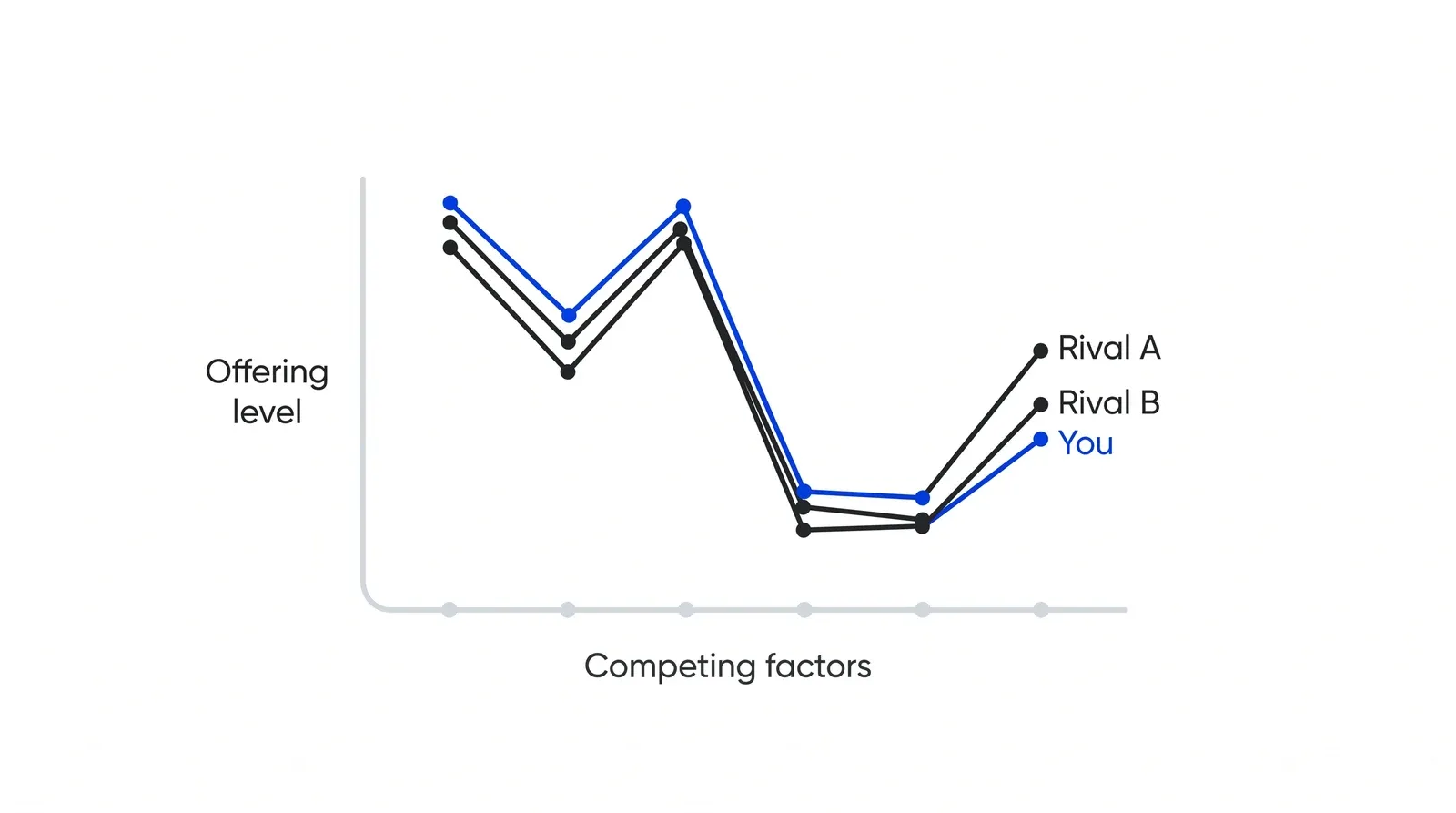
Converging curves are the warning sign. The authors’ pioneer-migrator-settler map calls me-too offers settlers. On a canvas, a settler’s curve sits on top of the rivals’ curves.
Reading the canvas: focus, divergence and a tagline
A good value curve passes three tests, which the authors list on their examples page. Focus: the curve invests heavily in a few factors instead of trying to be everything to everyone. Divergence: its shape breaks from the industry’s standard curve. A compelling tagline: one clear, truthful sentence describes it. Their tagline for Yellow Tail was “a fun and simple wine to be enjoyed every day,” and for the citizenM hotel chain, “affordable luxury for the people.”
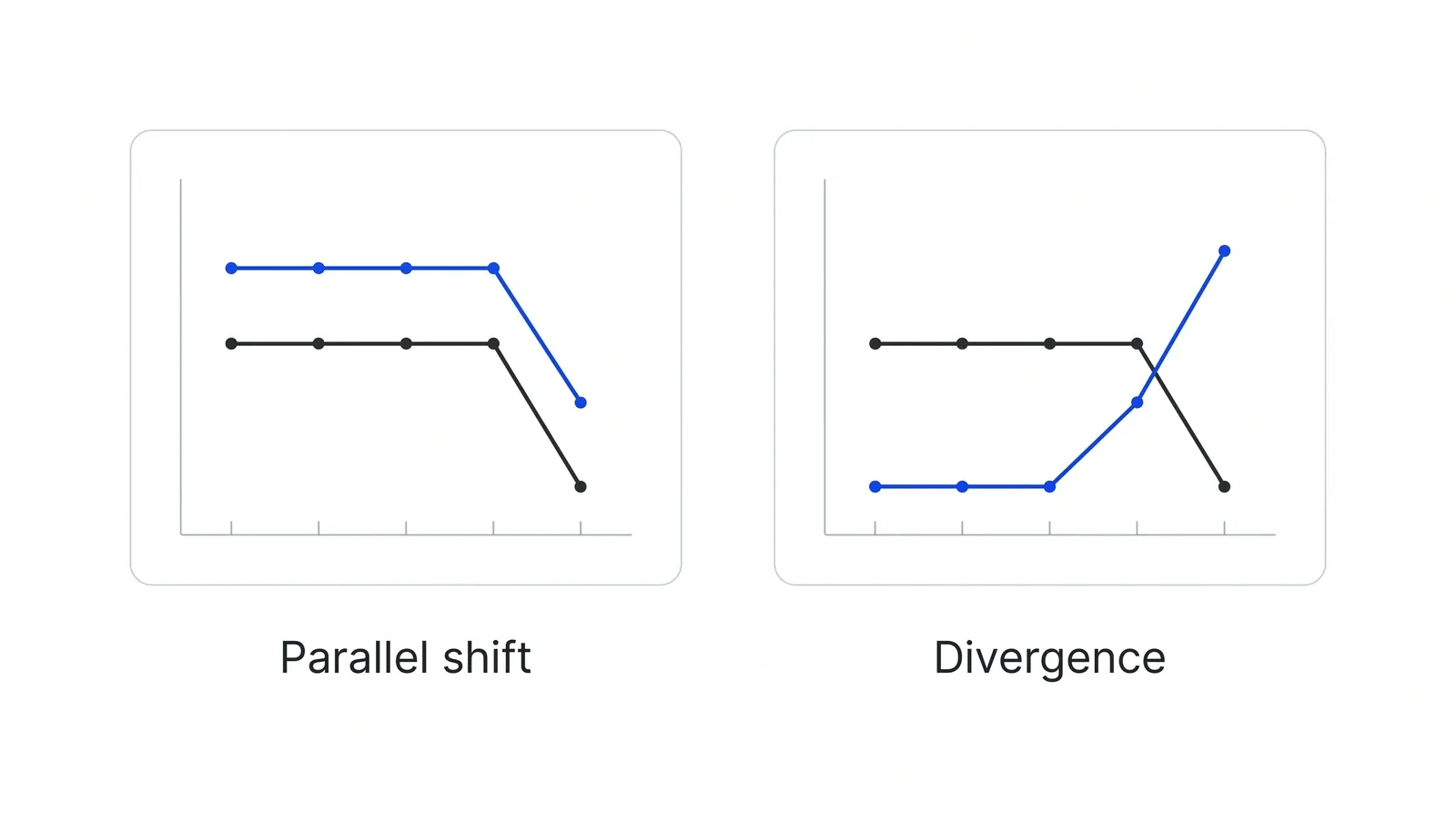
Divergence means a different shape. A curve that runs parallel to the industry, a notch higher on every factor, is a more expensive copy and carries the higher cost on every factor too.
When you read your own canvas, mark three things: factors where every player scores high but buyers barely mention them, which signal over-investment; factors where everyone scores low but buyers complain; and factors nobody offers yet. These become the candidates for the four actions of eliminate, reduce, raise and create.
Using the canvas to diagnose an underperforming business
The canvas also works as a diagnostic. Norman Sheehan and Vince Bruni-Bossio, writing in Business Horizons in 2015, use it to separate two problems: a firm delivering the wrong value proposition well, and a firm delivering the right one badly. Draw two curves for yourself, the one you intend and the one customers report, and the gap shows which problem you have.
The same logic travels outside product strategy. Ballesteros-Pérez and colleagues applied value curves to construction projects in the International Journal of Project Management in 2010. Raith, Staak and Wilker proposed a decision-analytic version that ties the curve to the gap between the benefit customers perceive and unit cost.
Running it as a team
Kim and Mauborgne describe four stages for drawing strategy with a group, summarised in the StratX Blue Ocean Strategy dictionary. In visual awakening, managers draw the as-is canvas to see the need for change. In visual exploration, they go into the field to learn from noncustomers. At a visual strategy fair, they present to-be canvases to executives, customers and noncustomers for critique. In visual communication, the company shares a one-page picture of the old and new profiles with every employee.
Strategy canvas, competitive matrix or positioning map?
The three tools are often confused because all three compare you with rivals.
| Strategy canvas | Competitive analysis matrix | Positioning map | |
|---|---|---|---|
| Shape | Line chart, many factors | Table of scores | Two axes, dots |
| Factors | 6 to 12 | As many as needed | 2 |
| Best for | Seeing whether offers look alike, redesigning one | Detailed feature and price comparison | Showing perceived position on two attributes |
Limits
Scores are judgements, so two teams can draw different canvases of the same market. The chart says nothing about whether a new curve can be delivered at a profit; that needs the cost check described in the authors’ value innovation logic. Agnihotri argues in the Journal of Strategic Marketing that the canvas suits any kind of innovation, not only blue ocean moves. In Pushers’ Growth Lab work, a canvas comes before the channel plan, because there is little point buying traffic for an offer whose curve matches everyone else’s.
How to apply Strategy canvas, step by step
- Name the industry and the buyer. Write down which market you are drawing and whose view you are scoring from. A canvas for freelancers choosing a payments app looks different from one for finance teams at importers. Result: one sentence naming the industry and the buyer group.
- List the competing factors. Start with price, then add every factor the industry competes on and invests in, worded the way a buyer would say it. Merge duplicates and drop internal jargon. Result: a list of roughly 6 to 12 factors in buyer language.
- Score every player on a 1 to 5 scale. Score your offer and each rival on every factor, where 1 means the buyer gets very little and 5 means a lot. Score price by its level, so an expensive offer scores high. Check the scores against customer quotes or market data. Result: a filled score table.
- Plot the curves. Put the factors on the horizontal axis in a fixed order, plot each player's scores, and join the dots with a line per player. Keep it to three or four curves so the picture stays readable. Result: the as-is canvas.
- Read it for focus, divergence and a tagline. Ask whether your curve peaks on a few factors, whether its shape differs from rivals, and whether you can describe it in one short honest sentence. Mark where the industry over-invests. Result: a short list of factors to cut, raise or add.
- Draw the to-be curve and test it. Plot the curve you want next to the industry's, then show it to customers, noncustomers and colleagues outside the team before committing budget. Result: a to-be canvas that people outside the room have challenged.
Examples
Southwest Airlines against full-service carriers
Brigham Young University's strategy course material uses Southwest as its main canvas example. Compared with full-service airlines, Southwest scores lower on airport convenience, network size and onboard amenities, and higher on low price, frequent departures, friendly service and on-time arrivals. The course adds a second canvas inside the discount segment, where JetBlue beats Southwest on seating, aircraft and in-flight TV while Southwest wins on price, punctuality and friendliness. The second chart shows why the choice of rivals changes what the canvas tells you.
Medellín Metrocable, scored against other transit
Kim and Mauborgne's site describes Medellín's cable car system as a canvas move against buses and trains. According to their write-up, it eliminated the land footprint between stations, reduced ride comfort compared with trains, raised hillside access and service frequency, and created a sense of fun that made the line a tourist attraction. The curve only makes sense because the factors were chosen from the rider's point of view, such as access to hillside neighbourhoods, and not from the operator's.
A dental clinic scoring itself honestly
Illustrative, no real clinic implied. A clinic lists six factors patients compare: price, waiting time for a first visit, evening hours, doctor reputation, interior and explanation of treatment cost. The team first scores itself 5 on cost explanation. Twenty patient reviews show most people were surprised by the final bill, so the score drops to 2. That single correction moves the clinic's curve onto the same shape as its two rivals, and the useful question becomes which factor patients would pay for that nobody scores well on.
When to use it
Use it when a leadership team argues about features or prices and needs one shared picture of how the offer compares, when sales say every deal comes down to price, or before a repositioning or a new product line. It also works as a diagnostic when a business trails rivals and nobody can say whether the offer or its delivery is the problem.
When not to use it
Skip it when the market is so new that buyers do not yet compare anything, when you have no access to customers to check scores, or when the question is narrow and numeric, such as a falling conversion rate on one page. A canvas drawn from the team's opinions alone tends to confirm what the team already believes.
Common mistakes
- Using factors in internal language, such as 'API coverage' or 'clinical protocols', that buyers would never mention. Word each factor the way a buyer compares offers.
- Scoring price by attractiveness, so a cheap offer scores 5. Score price by its level, or the curve becomes impossible to read against the other factors.
- Plotting only direct rivals. Kim and Mauborgne's examples compare across alternatives, as Yellow Tail did with beer and ready-to-drink cocktails.
- Filling the scores from the team's own view. Check each score against customer quotes, reviews or market data before drawing conclusions.
- Stopping at the as-is canvas. The chart describes the problem; the to-be curve and its test with buyers are what change the strategy.
FAQ
What is the difference between a strategy canvas and a value curve?
The strategy canvas is the whole chart: the competing factors on the horizontal axis and the offering level on the vertical axis. A value curve is one line on it, showing a single company's scores across those factors. One canvas usually carries three or four value curves, yours and your main rivals'.
How many factors should a strategy canvas have?
The authors' template sets no fixed number. In practice 6 to 12 factors works: fewer hides real differences, and more than about 12 makes the curves hard to read. If you have 20, merge the ones buyers treat as one thing, such as delivery speed and delivery tracking.
How do you score price on a strategy canvas?
Score price by its level, not by how attractive it is. An expensive offer scores high and a cheap one scores low, the same direction as every other factor, where a high score means the buyer gets more and the company spends more. A low-cost player therefore shows a dip at the price factor.
What makes a good value curve?
Kim and Mauborgne name three tests. Focus: the curve invests heavily in a few factors, not all of them. Divergence: its shape breaks from the industry's standard curve. A compelling tagline: you can describe it in one short, truthful sentence that a buyer would care about.
Can you make a strategy canvas in Excel?
Yes. Put the factors in the first column and one column of 1 to 5 scores per company, then insert a line chart with markers. Keep factors in the same order for every company. The tool matters less than checking the scores with buyers before you draw conclusions.
Sources
- Blue Ocean Strategy (Kim and Mauborgne), Strategy Canvas
- Blue Ocean Strategy (Kim and Mauborgne), Strategy Canvas Template
- Blue Ocean Strategy (Kim and Mauborgne), 5 Compelling Strategy Canvas Examples You Can Learn From
- Blue Ocean Strategy (Kim and Mauborgne), Four Actions Framework
- Blue Ocean Strategy (Kim and Mauborgne), ERRC Grid
- Blue Ocean Strategy (Kim and Mauborgne), Value Innovation
- Blue Ocean Strategy (Kim and Mauborgne), Six Paths Framework
- Blue Ocean Strategy (Kim and Mauborgne), Three Tiers of Noncustomers
- Blue Ocean Strategy (Kim and Mauborgne), Pioneer-Migrator-Settler Map
- Blue Ocean Strategy (Kim and Mauborgne), Five Steps to Making a Blue Ocean Shift
- W. Chan Kim, Renée Mauborgne, Charting Your Company's Future, Harvard Business Review, June 2002
- W. Chan Kim, Renée Mauborgne, Creating New Market Space, Harvard Business Review, January-February 1999
- Harvard Business Review Store, Value Innovation: The Strategic Logic of High Growth (originally published 1997)
- W. Chan Kim, Renée Mauborgne, Blue Ocean Strategy, Harvard Business Review, October 2004
- W. Chan Kim, Renée Mauborgne, Blue Ocean Strategy: From Theory to Practice, California Management Review 47(3), 2005
- StratX Simulations, Blue Ocean Strategy dictionary: Visual awakening, visual exploration, visual strategy fair, visual communication
- Brigham Young University, Learn Strategy: Strategy canvas
- Norman T. Sheehan, Vince Bruni-Bossio, Strategic Value Curve Analysis: Diagnosing and Improving Customer Value Propositions, Business Horizons 58(3), 2015
- Pablo Ballesteros-Pérez, M. Carmen González-Cruz, Juan Pascual Pastor-Ferrando, Analysis of Construction Projects by Means of Value Curves, International Journal of Project Management 28(7), 2010
- Matthias G. Raith, Thorsten Staak, Helge M. Wilker, A Decision-Analytic Approach to Blue-Ocean Strategy Development, Operations Research Proceedings 2007, Springer
- Brian Leavy, Value Pioneering: How to Swim in Your Own Ocean, Strategy & Leadership 33(3), 2005
- Arpita Agnihotri, Extending Boundaries of Blue Ocean Strategy, Journal of Strategic Marketing 24(6), 2016
Last updated Oct 9, 2026


Marketing agency or growth system: when a company outgrows its agency
An agency is the right call while the founder still runs most of the company. Once the business starts copying itself into new locations or markets, it needs a system that sets goals, tests hypotheses and owns the result.

Why healthcare marketing agencies stall: the short, mid and long wins model we use with clinics
Most agencies own the click and nobody owns the front desk. How we structure clinic work in three horizons, the research behind each one, and one year of results.

Why channel tests stall after month three
Most paid channel tests do not end with a decision. They end when the budget runs out, the attribution model changes, or everyone quietly stops looking at the dashboard.