Friction audit
A friction audit walks one customer journey step by step, collects evidence of where people struggle, doubt or leave, and ranks the causes so a team fixes the costliest first.
A friction audit is a structured review of one customer journey that finds every step costing people effort, time or doubt, backs each finding with data, and ranks the findings by impact. It has no single inventor. It combines usability inspection, funnel data and behavior analytics. The output is a ranked list of fixes, not a list of opinions.
- Origin
- No single author: usability inspection (Jakob Nielsen, Rolf Molich), customer effort research (Matthew Dixon and colleagues), the sludge audit (Cass Sunstein), 1990; 2010; 2020
- Level
- 301 · Advanced
- Fits
- Small and mid-size, Scale-up
- Time to apply
- 3 to 5 working days for one journey
- What you need
- one journey with one measurable outcome, such as a paid order or a booked visit · analytics with step-level events and a device split · a session-replay or click-behavior tool on the pages being audited · 5 recruited users, or a day of access to support tickets and call recordings
A friction audit is a structured review of one customer journey that finds the steps where people spend extra effort, time or doubt, proves each one with data, and ranks them by how much they cost. It is a practice, not a framework with an author. It borrows its parts from usability inspection, funnel analysis and customer effort research, and the term itself is used loosely, so this page defines the method as a plan you can run.
The reason to do it is large and measurable. Baymard Institute’s list of cart abandonment studies puts the average documented abandonment rate at 70.22 percent across 50 studies. On the same page, Baymard estimates that better checkout design alone could recover $260 billion of lost orders in the US and EU, applying a 35.26 percent conversion gain from its own testing of large retail sites. That estimate is Baymard’s model, not a guarantee for your store.
What counts as friction
Friction is anything between a person and their goal that costs effort, time or confidence. Nielsen Norman Group calls the total interaction cost: the mental and physical effort of reading, scrolling, searching, clicking, typing, waiting and remembering. Its summary is that marketing raises perceived benefit while usability lowers the cost.
The useful move is to sort findings by type, because each type has a different fix.
| Type | What the customer feels | Typical finding | Where to read more |
|---|---|---|---|
| Effort | “This is a lot of work” | Long forms, forced account creation, too many clicks | Fogg’s ability factor |
| Confusion | “What do I do here?” | Unclear button, hidden delivery cost, unexpected error | LIFT clarity |
| Doubt | “Can I trust this?” | No payment-security cues, vague return policy | LIFT anxiety |
| Delay | “Why is this slow?” | Slow pages, unexplained wait for approval | Response-time limits |
| Deliberate | “I was tricked” | Hidden fees, pre-ticked boxes, hard-to-find cancel | Dark patterns |
Baymard’s survey list shows all five. Among US shoppers who abandoned a checkout, 40 percent cited extra costs, 18 percent a required account, 17 percent a long or complicated checkout, 17 percent site errors and 12 percent not being able to see the total cost up front. Respondents could give several reasons, and the page does not state the survey year or sample size.
Three kinds of evidence
A finding is reliable when two kinds of evidence agree. Numbers say where people leave, behavior says what they did, and people say why.
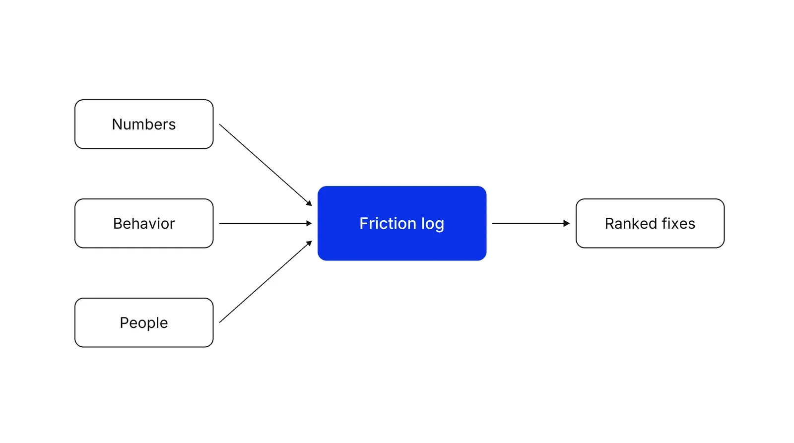
Numbers. Build a funnel with one event per step. Google’s funnel exploration in GA4 lets you break each step down by device category, which often shows a step that fails only on phones. The funnel analysis page covers how to read it without being fooled by segment mixes.
Behavior. Replay tools flag patterns that suggest a problem. In Microsoft’s Clarity documentation, a rage click is repeated clicking in a small area in quick succession, a dead click gets no feedback in a reasonable time, and a quick back is a return to the previous page under a time threshold. Treat these as places to watch, not as proof.
People. Task tests and expert review explain the cause. Nielsen and Molich’s 1990 paper found that individual evaluators caught 20 to 51 percent of usability problems, while aggregates of three to five did much better. NN/g’s heuristic evaluation guide repeats the three-to-five advice, and its cognitive walkthrough method asks four questions at each step: will users try the right thing, notice the control, link it to their goal, and see progress.
For user tests, Nielsen’s five-user model says one user reveals about 31 percent of problems and five reveal about 85 percent, which is why he recommends several small rounds with fixes in between.
Scoring: reach, severity, effort
A log with 40 rows is useless until it is ranked. Use three numbers per row.
| Finding | Reach (share of users hitting the step) | Severity (1 to 3) | Effort to fix (1 to 3) | Score = reach x severity / effort |
|---|---|---|---|---|
| Delivery cost shown only at payment | 0.60 | 3 | 1 | 1.8 |
| Forced account creation | 0.60 | 2 | 2 | 0.6 |
| Error message does not name the bad field | 0.15 | 3 | 1 | 0.45 |
The numbers above are illustrative arithmetic, not data from a real store. The point is that a mild problem on a busy step can outrank a severe problem on a rare one, and cheap fixes float up.
Fixes that pay: documented cases
Small changes at the right step can matter. Jared Spool reported that one retailer replaced a mandatory Register button on its checkout login form with a Continue button, and purchases rose about 45 percent, worth an estimated $300 million in the first year. It is a single case reported by a consultant, so use it as a pointer to look at forced registration, not as a forecast.
Forms are the usual suspect. Baymard’s benchmark found an average of 11.3 checkout form fields in 2024 against a recommended 8, and suggests hiding Address Line 2 and the coupon field and delaying account creation. NN/g’s forms guidance cites a CHI 2014 study by Seckler and colleagues, a 65-participant eye-tracking experiment, in which 78 percent of users submitted a guideline-following form without errors first time, against 42 percent for a violating one.
Speed is friction too. In a Google-commissioned study by 55 and Deloitte of 37 brand sites and more than 30 million sessions, a 0.1 second improvement in four speed metrics lifted retail conversion 8.4 percent and travel conversion 10.1 percent.
Friction you should keep
Not every step is waste. Cass Sunstein’s sludge audit targets frictions that are “excessive or unjustified,” and recommends firms audit them regularly. Identity checks in finance, consent in healthcare and confirmations before a payment protect people. The audit question for those steps is how to make them quicker to complete, not whether to delete them.
At the other end is deliberate friction. Mathur and colleagues’ crawl of 11,000 shopping sites found 1,818 instances of dark patterns across 15 types. If an audit finds one, the fix is removal, and the legal question belongs with counsel.
How it relates to other methods
Run CRO after the audit: the log supplies hypotheses and CRO tests them. Customer effort score is the survey to track after a fix, since it asks how easy the interaction was, an idea from Dixon, Freeman and Toman’s HBR study of more than 75,000 people. When the cause sits in the back office, draw a service blueprint. A Growth Lab plan starts from one audited journey and a ranked log rather than a site-wide redesign: see Growth Lab.
How to apply Friction audit, step by step
- Choose one journey and one outcome. Pick the path with the most money or volume behind it, for example ad click to paid order. Write the outcome as a single event you can count. Result: a scope of one journey with a baseline conversion rate.
- List every step, field and wait. Walk the journey yourself on a phone and on a desktop. Record each page, form field, decision, wait and handoff to a person. Result: a step list, which is the spine of the friction log.
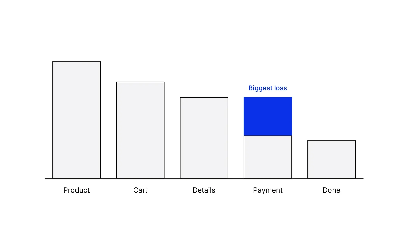
- Find where people leave. Build a funnel with each step as an event and split it by device category. Mark the steps with the biggest drop. Result: a short list of steps where the evidence is strongest, and a note of any step where the data is missing.
- Explain the drops with behavior and people. Watch replays of sessions that stopped at those steps and flag rage clicks, dead clicks and quick backs. Then run 5 task tests, or read support tickets for the same step. Result: for each drop, a stated cause with at least two kinds of evidence.
- Write the friction log and score it. One row per finding: step, what happens, type of friction, evidence, share of users reaching the step, severity from 1 to 3, effort to fix. Multiply reach by severity and divide by effort. Result: a ranked list.
- Fix the top items, then re-measure. Take the top three, ship them one at a time or as an A/B test, and read the same funnel step afterwards. Remove items from the log only when the step improves. Result: a measured change per fix and an updated log.
Examples
An online store with a long checkout
Illustrative. A store sees 1,000 carts a month and 300 paid orders. The funnel shows the biggest drop between the details page and payment, worse on phones. Replays show people reopening the page to find the delivery cost, and a forced account step. The log ranks 'delivery cost shown only at payment' first. The fix is a cost estimate on the cart page, then guest checkout.
Onboarding at a payments app
Illustrative. A fintech app loses most applicants at identity verification. Calls and replays show failed document photos on the first try with no guidance on lighting or framing. The verification itself is required by regulation and stays. The audit targets the instructions, the retry path and the wait message, not the check.
A clinic booking form
Illustrative. A clinic site has a 9-field booking form and many calls asking 'did my request go through?'. Two fields can be derived from the phone number, and the confirmation screen says nothing about when the clinic will respond. The log lists cutting fields and a clear confirmation, both cheap, ahead of a calendar redesign.
When to use it
Use it when a journey has a measurable drop you cannot explain, before a redesign so the redesign targets real causes, or when support tickets cluster around one step. It fits journeys with at least a few hundred visits a month, so the funnel shows a stable pattern.
When not to use it
Skip it when traffic is too small for step-level numbers, and run user tests first. Skip it when the real problem is the offer or the audience, since removing friction from a page nobody wants only speeds up the exit. For testing the fixes, use CRO; for a whole-service view with back-office steps, use a service blueprint.
Common mistakes
- Auditing the whole site at once. A journey with no outcome event produces a long list and no priority. Audit one path.
- Relying on expert opinion alone. Individual evaluators in Nielsen and Molich's 1990 experiments found only 20 to 51 percent of problems, so use several reviewers and add data.
- Removing friction that protects the customer or the company, such as identity checks, payment confirmations and consent. Redesign how it feels, not whether it exists.
- Reading session replays without a question. Start from a funnel drop, then watch only sessions that stopped there.
- Ending with a document. If the log has no owner, no effort estimate and no re-measure date, nothing gets fixed.
FAQ
What is a friction audit?
A friction audit is a structured review of one customer journey that finds steps costing people effort, time or doubt, and ranks them by impact. It combines funnel data, behavior analytics such as rage clicks, and user tests or expert review, and ends in a prioritized list of fixes.
How is a friction audit different from a conversion audit or CRO?
A conversion audit usually reviews a site against a checklist. A friction audit is narrower and evidence-led: one journey, each step's cost, each finding backed by data. It feeds CRO, which then tests the fixes. The audit finds what to test; CRO proves it worked.
How do you find friction on a website?
Use three kinds of evidence. Numbers: a funnel by step and device. Behavior: replays and signals like rage clicks, dead clicks and quick backs. People: task tests with about five users, or support tickets for the same step. A finding with two kinds of evidence is solid.
How many users do you need for a friction audit?
For usability tests, Nielsen's model says five users reveal about 85 percent of problems, with each user finding about 31 percent. He advises several small rounds with fixes in between. Funnel and replay analysis needs enough traffic for stable step rates, usually hundreds of visits per step.
Is all friction bad?
No. Identity checks, payment confirmations and consent screens add effort on purpose. Cass Sunstein's sludge audits target friction that is excessive or unjustified, not friction that serves a purpose. Keep protective friction and make it as easy to complete as you can.
Sources
- Baymard Institute, Cart Abandonment Rate Statistics
- Baymard Institute, Checkout flow: average form fields
- Matthew Dixon, Karen Freeman, Nick Toman, Stop Trying to Delight Your Customers, Harvard Business Review, July-August 2010
- Nielsen Norman Group, Interaction Cost
- Jared Spool, The $300 Million Button, User Interface Engineering, 2009
- Cass R. Sunstein, Sludge Audits, Behavioural Public Policy 6(4), 2022 (online 2020)
- Microsoft Learn, Clarity semantic metrics
- Nielsen Norman Group, 10 Usability Heuristics for User Interface Design
- Nielsen Norman Group, How to Conduct a Heuristic Evaluation
- Jakob Nielsen, Rolf Molich, Heuristic Evaluation of User Interfaces, CHI 90 Proceedings, 1990
- Nielsen Norman Group, Why You Only Need to Test with 5 Users
- Nielsen Norman Group, Website Forms Usability: Top 10 Recommendations
- Nielsen Norman Group, Cognitive Walkthroughs
- Nielsen Norman Group, Response Times: The 3 Important Limits
- Nielsen Norman Group, Usability 101: Introduction to Usability
- Google, [GA4] Funnel exploration, Analytics Help
- Google and Deloitte, Milliseconds Make Millions, web.dev
- Arunesh Mathur and colleagues, Dark Patterns at Scale: Findings from a Crawl of 11K Shopping Websites, CSCW 2019
- BJ Fogg, Ability, behaviormodel.org
- Chris Goward, Conversion.com, The LIFT Model
- Mirjam Seckler and colleagues, Designing Usable Web Forms, CHI 2014, Google Research
Last updated Oct 9, 2026


Marketing agency or growth system: when a company outgrows its agency
An agency is the right call while the founder still runs most of the company. Once the business starts copying itself into new locations or markets, it needs a system that sets goals, tests hypotheses and owns the result.

Why healthcare marketing agencies stall: the short, mid and long wins model we use with clinics
Most agencies own the click and nobody owns the front desk. How we structure clinic work in three horizons, the research behind each one, and one year of results.

Why channel tests stall after month three
Most paid channel tests do not end with a decision. They end when the budget runs out, the attribution model changes, or everyone quietly stops looking at the dashboard.