Ishikawa diagram
An Ishikawa diagram, also called a fishbone or cause-and-effect diagram, puts one problem at the head of a spine and groups its possible causes on branches, so a team can see every suspect before it tests any of them.
An Ishikawa diagram, also called a fishbone or cause-and-effect diagram, is a chart that puts one problem at the head of a horizontal spine and groups its possible causes on branches such as methods, materials, people and equipment. Teams use it to map every suspect before testing them with data. It lists possible causes and proves none of them.
- Origin
- Kaoru Ishikawa, Early 1950s (accounts differ); popularised by his 1968 Guide to Quality Control
- Level
- 201 · Tool
- Fits
- Small and mid-size, Scale-up, Enterprise
- Time to apply
- 60 to 90 minutes for a first diagram, plus a week or two of data collection
- What you need
- a problem you can state with a number, a place and a time period · 4 to 8 people who touch different parts of the process · cards or sticky notes, and a wall or whiteboard large enough for a spine and six branches
An Ishikawa diagram is a chart that puts one problem at the head of a horizontal arrow and groups its possible causes on branches coming off the arrow, so a team sees the whole range of suspects before testing any of them. It is also called a fishbone diagram, for its shape, and a cause-and-effect diagram, for its job. ASQ lists it first among the seven basic quality tools and credits Kaoru Ishikawa. The diagram produces hypotheses, not findings, and the useful part of the method is what happens after the drawing.
Who invented the Ishikawa diagram, and when?
Kaoru Ishikawa, a Japanese engineer and quality-control teacher, developed it. The Union of Japanese Scientists and Engineers (JUSE) credits him with it, and ASQ’s profile of Ishikawa calls it perhaps the achievement he is best known for. The date is less settled. The version most often repeated online says 1943, at Kawasaki Steel. We found no primary source for it, and the other accounts disagree.
| Date given | Where it appears | What checks out |
|---|---|---|
| 1943, at Kawasaki Steel Works | Consultancy and training sites that copy each other | No primary source found. Kawasaki Steel as a company was formed in August 1950, although the Fukiai Works dates from 1917, so 1943 would mean a predecessor |
| Idea in 1950, first use at Kawasaki Steel in 1952 | A practitioner’s account relaying Ishikawa’s textbook Introduction to Quality Control (1989); the TPS Encyclopedia says 1952 or 1953 | Closest to Ishikawa’s own recollection. We could not read the book itself |
| 1968 | The NHS England guide, citing Guide to Quality Control | The date of the book. SPC for Excel says the Guide came out in Japan in 1968; the English edition is dated 1976 |
Our reading is that Ishikawa worked the idea out in the early 1950s and that the Guide made it a standard tool. ASQ says the seven basic tools were first highlighted in that book. The Japanese name, tokusei yōin zu, translates as characteristics-and-factors diagram, a plainer description than “fishbone.”
How is a fishbone diagram built?
The head holds the problem, the spine leads to it, the main branches are categories of cause, and the twigs are individual causes. Each twig can sprout smaller twigs that answer “why does this happen?” Layers of branches show causal relationships, in ASQ’s procedure.
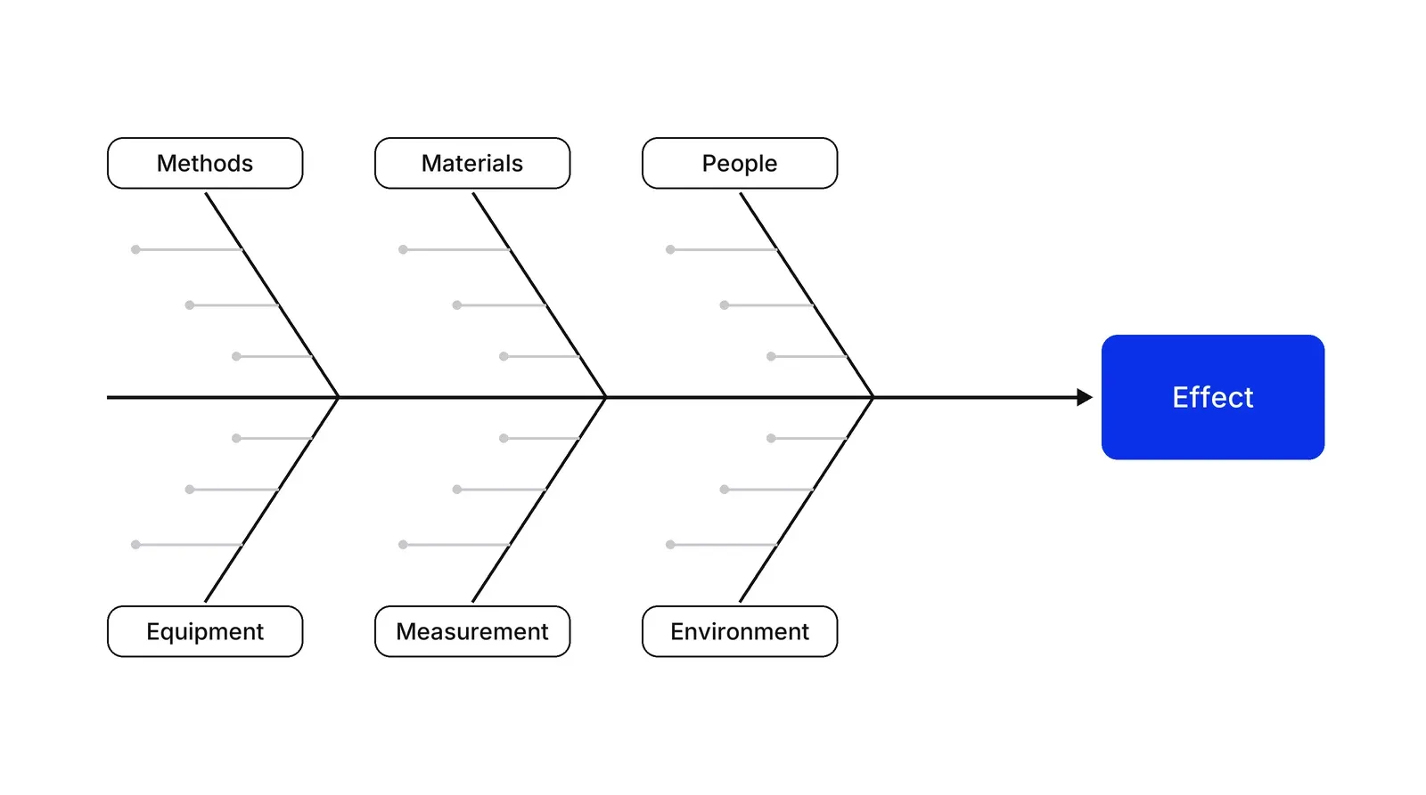
The categories are a prompt, not a law. ASQ says Ishikawa offered the 6 Ms as generic labels and also encouraged creative names that communicate more clearly to the people using the diagram; a 2019 Quality Progress article likewise ties the six Ms to his design. Three sets cover most uses.
| Set | Categories | Fits |
|---|---|---|
| 6 Ms (ASQ) | Materials, machinery, methods, measurement, manpower, mother nature; money is an optional seventh | Production and manufacturing |
| Service set (NHS England) | Equipment, environment, procedures, people, or others relevant to the problem | Clinics, offices, front-line services |
| Process type (IHI) | One branch per step of the process | A problem somewhere in a known flow |
The process-type version needs a process map first. A SIPOC fixes where the process starts and ends, a BPMN model gives the steps, and for a customer-facing service a service blueprint shows which steps sit below the line of visibility, where customers never see the cause.
Why should people write causes alone first?
Groups that brainstorm aloud produce fewer ideas than the same people working separately. A 1991 meta-analysis by Mullen, Johnson and Salas found brainstorming groups were significantly less productive than nominal groups, in quantity and quality. Diehl and Stroebe’s four experiments in 1987 traced most of the loss to production blocking: only one person can speak at a time, and ideas fade while others wait their turn. Hence the cards-first rule in the steps above.
The categories you choose also steer what the team notices. In a 1978 study of fault trees, which sort things that could go wrong into functional categories much as a fishbone does, Fischhoff, Slovic and Lichtenstein found people were quite insensitive to what had been left out. A fishbone differs from a fault tree, yet the lesson carries over: after the diagram is full, ask what has no bone.
One more habit matters. “Operator error” is the cause that ends discussion fastest. James Reason, in the BMJ, contrasted a person approach, which blames individuals for forgetfulness or inattention, with a system approach that studies the conditions under which people work. A fishbone supports the second view only if the team keeps asking what made the slip likely.
What the diagram cannot do
A fishbone does not rank causes and does not prove them. NHS England’s guide says that once the diagram exists, you should investigate the factors further with data check sheets, interviews and process mapping. ASQ’s own complex example ends the same way: the diagram showed the process was complicated, so the team decided it needed more data and proposed a check sheet to count lab errors.
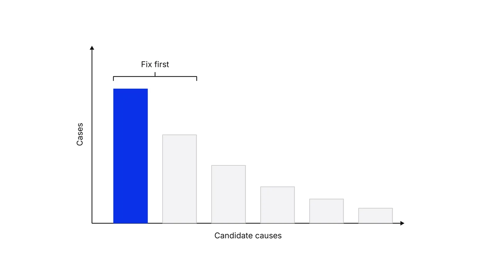
That counting step is where a Pareto chart helps: a bar graph with the longest bars on the left, so the most frequent causes stand out. Michael Doggett’s 2005 comparison of the cause-and-effect diagram with two other root cause tools found that each has advantages and disadvantages, and that the literature offers no objective way to choose between them. Gerald Smith’s 1998 review of how other fields diagnose problems assesses the popular techniques and the use of taxonomies of causes, which is what the 6 Ms are.
Healthcare researchers raise a deeper objection. Peerally and colleagues argue in BMJ Quality & Safety that the phrase “root cause” implies one cause, which promotes a flawed reductionist view of incidents with several interacting contributors. The National Patient Safety Foundation’s RCA2 guidance concedes that root cause analyses have had inconsistent success, and puts the weight on the actions taken afterwards. Treat the diagram as a way to widen the search, then narrow it with evidence.
Fishbone, 5 whys and Pareto chart: which one when?
The three tools answer different questions and are often used in sequence.
| Tool | Question it answers | What you get |
|---|---|---|
| Fishbone | What could be causing this? | A grouped map of suspects |
| 5 whys | Why did this one failure happen? | A single chain of causes |
| Pareto chart | Which causes account for most cases? | Causes ranked by frequency or cost |
A common order is to widen with the fishbone, rank the suspects with counts, then go deep on the top one with repeated “why” questions. Peerally and colleagues criticise the five whys for favouring a timeline-style story over a systems view, which is a reason to run it on one confirmed cause and not on the whole problem.
If the problem sits inside a marketing or revenue process, a marketing operational system review starts from the same two things this diagram needs: a defined process and numbers for each step.
How to apply Ishikawa diagram, step by step
- Write the problem as a measurable statement. State what happens, where, when and how much: 'one in five booked appointments ends in a no-show, mostly in the first week of the month.' The NHS England improvement guide asks for exactly these four details and says to use data. Result: one sentence that goes in the head of the fish and does not hint at a cause.
- Draw the spine and pick the categories. Draw a horizontal arrow pointing at the problem box. Add four to six branches. Use the 6 Ms (materials, machinery, methods, measurement, manpower, mother nature) for production, a shorter set such as people, procedures, equipment and environment for services, or one branch per step if you have a process map. Result: an empty fishbone with categories that fit this problem.
- Let everyone write causes alone. Give each person five minutes to write one cause per card, without talking. Research on brainstorming finds that people waiting for their turn lose ideas. Result: a pile of cards that reflects each person's view, not the loudest voice's.
- Place the cards and ask why. Stick each card on the branch where it fits. A cause can sit on two branches. For each card ask 'why does this happen?' and add the answers as smaller twigs. Result: a diagram with two or three layers of causes.
- Look for what has no bone. Read the finished diagram and ask which causes do not fit any category, and which branch is nearly empty. Add a branch if needed. Result: a fishbone whose categories did not decide in advance what the team could see.
- Mark suspects and test them with data. Vote on the three to five causes most likely to matter, then check each against facts: a tally sheet, a log, timestamps, five customer calls. Keep the causes the data supports. Result: a short list of confirmed causes, each with an owner.
Examples
A dental clinic with too many no-shows
Illustrative. Problem: one in five booked slots ends unattended. People: reception confirms by phone only during office hours. Methods: appointments are booked six weeks ahead, and there is no one-click cancel link in the reminder. Materials: a third of patient phone numbers are out of date. Measurement: the booking system records 'no-show' with no reason. Environment: the clinic has little parking. Equipment: reminders go out by SMS from a tool that bounces foreign numbers. The team writes down the reason for every no-show for four weeks. The tally shows outdated phone numbers and no easy cancel option account for most cases, so those two get owners. Parking and the SMS tool wait.
A payments company losing merchants at onboarding
Illustrative. Problem: more than a third of merchant applications stall before approval. Methods: every application waits in one manual review queue. Materials: document photos taken on phones are often unreadable. Equipment: the upload page times out on slow mobile connections. People: two of four reviewers started this quarter. Measurement: the system stamps start and end but not each step. Environment: the partner bank only processes new accounts on weekdays. The team adds step timestamps for two weeks. The data points to the review queue and unreadable photos, so it adds a photo-quality check at upload and a second reviewer shift.
When to use it
Use it when a measurable problem has many possible causes and a team with different viewpoints needs to list them before it picks what to investigate: defects, late deliveries, drop-offs in a funnel, repeat complaints. It works best early, before anyone has settled on an explanation, and when the process is stable enough that causes can be checked.
When not to use it
Skip it when the cause is already visible in the data, when a single failure needs a straight chain of questions (use 5 whys), or when the problem is an interaction of many parts and feedback loops. A fishbone is a poor fit when nobody can collect data afterwards, because the diagram on its own proves nothing.
Common mistakes
- A vague problem statement such as 'quality is low' or 'sales are weak'. Without a number, a place and a period, every cause on the board looks equally plausible.
- Writing 'human error', 'careless' or 'not trained' as the cause. James Reason's person-versus-system distinction applies: ask what in the conditions made the slip likely.
- Letting one person draw it. A single author fills the bones with their own view and the group gains nothing from meeting.
- Treating the longest branch as the biggest cause. Branch length shows how many ideas the team had, not how often each cause occurs. Only counts from real cases rank causes.
- Stopping at the diagram. NHS England and ASQ both describe the fishbone as a step before data collection, not the end of the analysis.
FAQ
What is an Ishikawa diagram used for?
It is used to list and organise the possible causes of one specific problem before a team investigates. The problem sits at the head of the diagram and causes sit on branches grouped by category. ASQ calls it especially useful for structuring brainstorming. It generates hypotheses that data must then confirm or reject.
What are the 6 Ms in a fishbone diagram?
They are materials, machinery, methods, measurement, manpower and mother nature, meaning the environment. ASQ says Ishikawa introduced them as generic labels but encouraged teams to rename categories so people understand them, and adds money as an optional seventh. For services, shorter sets such as people, procedures, equipment and environment work well.
Who invented the Ishikawa diagram and when?
Kaoru Ishikawa developed it, but the date is disputed. A widely repeated 1943 date has no primary source we could find. An account relayed from Ishikawa's own textbook puts the idea around 1950 and first use at Kawasaki Steel two years later. His Guide to Quality Control, first published in Japan in the late 1960s, spread it.
What is the difference between a fishbone diagram and 5 whys?
A fishbone spreads out: it asks what could be causing a problem and collects causes across categories. 5 whys goes deep: it follows one failure through repeated 'why' questions. They combine well, because asking why of each fishbone cause adds the sub-branches. Neither ranks causes or proves them.
Is a fishbone diagram a root cause analysis?
It is one input to root cause analysis, and not a complete method. A 2005 comparison of cause-and-effect diagrams with two other tools found each has advantages and disadvantages for finding root causes. Healthcare researchers also warn that the phrase 'the root cause' pushes teams toward a single-cause view when incidents have several.
Sources
- ASQ, What is a fishbone diagram? Ishikawa cause and effect diagram
- ASQ, Seven basic quality tools
- ASQ, Kaoru Ishikawa, honorary member profile
- ASQ, What is a Pareto chart?
- Gregory H. Watson, Ekaterina A. Spiridonova, Fish(bone) Stories, Quality Progress 52(8), 2019
- Kaoru Ishikawa, Guide to Quality Control, Asian Productivity Organization, 1976, Internet Archive record
- Union of Japanese Scientists and Engineers (JUSE), Ishikawa Kaoru at a glance
- JFE Holdings, JFE Group prehistory: Kawasaki Steel timeline
- Hide Oba, Understanding the original fishbone diagram, LinkedIn Pulse (relays Ishikawa's Introduction to Quality Control, 1989)
- Art of Lean, TPS Encyclopedia: Ishikawa diagram
- SPC for Excel, Dr. Ishikawa's seven quality tools
- NHS England, Quality, Service Improvement and Redesign tools: Cause and effect (fishbone)
- Institute for Healthcare Improvement, Cause and Effect Diagram
- National Patient Safety Foundation, RCA2: Improving Root Cause Analyses and Actions to Prevent Harm, via IHI
- Bobby Peerally, Susan Carr, Justin Waring, Mary Dixon-Woods, The problem with root cause analysis, BMJ Quality & Safety 26(5), 2017
- James Reason, Human error: models and management, BMJ 320, 2000
- Michael J. Doggett, Root cause analysis: a framework for tool selection, Quality Management Journal 12(4), 2005
- Gerald F. Smith, Determining the cause of quality problems: lessons from diagnostic disciplines, Quality Management Journal 5(2), 1998
- Baruch Fischhoff, Paul Slovic, Sarah Lichtenstein, Fault trees: sensitivity of estimated failure probabilities to problem representation, Journal of Experimental Psychology: Human Perception and Performance 4(2), 1978
- Michael Diehl, Wolfgang Stroebe, Productivity loss in brainstorming groups: toward the solution of a riddle, Journal of Personality and Social Psychology 53(3), 1987
- Brian Mullen, Craig Johnson, Eduardo Salas, Productivity loss in brainstorming groups: a meta-analytic integration, Basic and Applied Social Psychology 12(1), 1991
Last updated Oct 9, 2026

Fractional COO or embedded operations team? How to choose at Series A
The two models solve different problems: how to tell which one your company needs, and what each costs in time and control.

What operational systems successful fintech startups use: lessons from ten companies
Starling, Monzo, Qonto, bunq, Lunar, Pleo, Tide, Ramp, Mercury and Column scaled on four operating systems. Regulators' findings show what breaks when one of them lags behind growth.
What a revenue operations manager actually owns
Pipeline definitions, CRM hygiene, forecasting and the handoffs between marketing, sales and success. What the role covers, and how it differs from sales ops.